-
Notifications
You must be signed in to change notification settings - Fork 68
Description
Hi,
This is not an issue report, but I would like to share my workflow for visualizing FastANI results as I think it will be useful for other users.
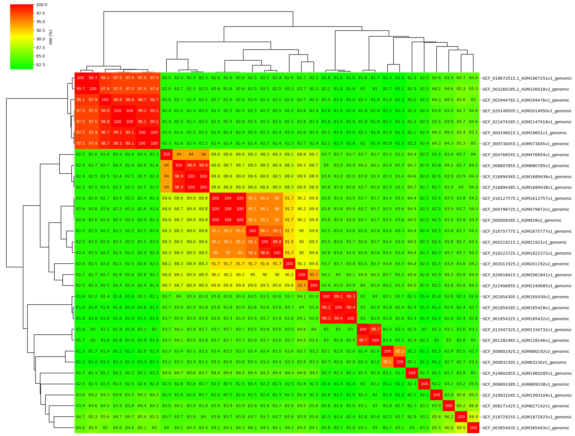
1. Visualize all-vs-all ANI matrix
I developed a Python tool ANIclustermap for visualization of ANI calculation results using FastANI, which can automatically perform the workflow from ANI calculation among all-vs-all genomes to clustering and visualization of ANI matrix. It can output the following figure, clustered ANI matrix, newick format dendrogram.
2. Visualize Conserved Regions b/w Two Genomes
A visualization R script using genoPlotR is already provided, but I thought it would be nice to have one for Python users, so I created a Python script (visualize.py) that can plot the following figure. See repository for details of the script.
Example 1.
colormap=hsv, link_color=grey, curve=False (Default)
python visualize.py B_quintana.fna B_henselae.fna fastani.out.visual example01.pngExample 2.
colormap=viridis, link_color=red, curve=True
python visualize.py B_quintana.fna B_henselae.fna fastani.out.visual example02.png --cmap viridis --link_color red --curve Hope this information helps other users.
Thanks.


