Conversation
|
@yucheng11122017 Using the slash is fine if there is no confusion when there is a slash in the text itself. Perhaps the slash can be formatted differently from the text? Also dig around resources such as this to see if there are relevant ideas https://www.smashingmagazine.com/2009/03/breadcrumbs-in-web-design-examples-and-best-practices/ |
Oh I see your concern Prof. I found some icons which I think may work and imo looks nicer than the current fix Glyphicons menu right Not sure if this is useful @itsyme |
|
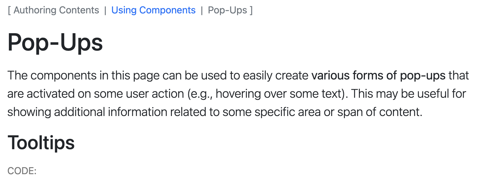
Thank you for the feedback @damithc @yucheng11122017! What do you think about the below? I feel that it makes the square brackets make the breadcrumb look less like stray text when there is only one item and the pipe would help reduce the confusion between text and the breadcrumb separator as pipe would be much less common in titles.
|

|
I fear both |
|
Some possible ideas for the design as well, most of them seem to use arrows or backslash (or some variations of those), I've also seen https://mui.com/material-ui/react-breadcrumbs/ Personally, I think arrows (Glyphicons menu right as suggested by @yucheng11122017) or emboldened backslash might work well with the square brackets? Alternatively, we can have the backslash as a default and provide an option to use a custom separator like this, would that be a possibility @damithc? Since having backslash in the heading might be a specific rather than a general use case. |
|
Yup, looking better. But let's try to use suitable icons in this PR itself. |
|
Hi @damithc! I was wondering if the latest icons for breadcrumbs are to your liking? |
What is the purpose of this pull request?
Overview of changes:
Added a ">>" before the start of breadcrumbs and changed the icons between links of breadcrumbs to ">" to increase clarity.
Anything you'd like to highlight/discuss:
Testing instructions:
Proposed commit message: (wrap lines at 72 characters)
Update Breadcrumb icons
Checklist: ☑️