A comprehensive Neo-Brutalist design system for SwiftUI, featuring bold borders, offset shadows, and vibrant color themes.
- Multi-Level Theming - Hierarchical theme system supporting nested color variations
- Pre-built Components - Cards, notices, pickers, and more with brutalist styling
- Custom Styles - Brutalist implementations for buttons, toggles, text fields, progress views, and other SwiftUI controls
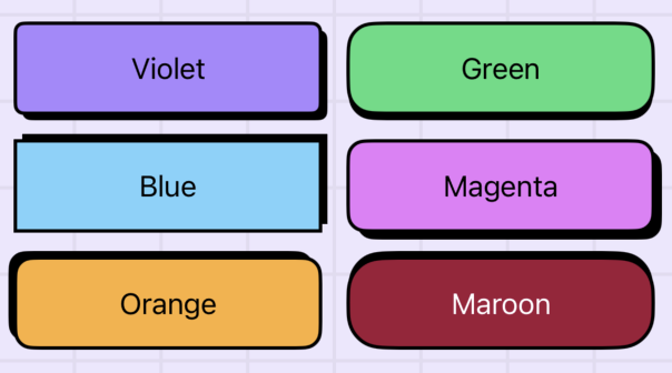
- Flexible Theming - Five built-in color themes (Violet, Blue, Orange, Green, Multi) plus custom theme support
- Dark Mode Support - Automatic color scheme adaptation
- View Modifiers - Easy-to-use modifiers for applying brutalist styling to any view
- iOS 15.0+ / macOS 12.0+ / tvOS 15.0+ / watchOS 8.0+
- Swift 5.9+
- Xcode 15.0+
Add Brute to your project using Xcode:
- Go to File → Add Package Dependencies
- Enter the package URL:
https://github.com/Lukas-Simonson/Brute - Select the version you want to use
Or add it to your Package.swift:
dependencies: [
    .package(url: "https://github.com/Lukas-Simonson/Brute", from: "1.0.0")
]Wrap your app's content in BruteStyle to apply the brutalist design system:
import SwiftUI
import Brute

@main
struct MyApp: App {
    var body: some Scene {
        WindowGroup {
            BruteStyle {
                ContentView()
            }
        }
    }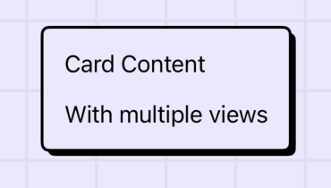
}A styled container for presenting content in a card format:
BruteCard {
    Text("Card Content")
    Text("With multiple views")
}
Display important information with prominent styling:
VStack {
    BruteNotice("Info", systemImage: "info.circle") {
        Text("This is an informational notice component")
    }

    BruteNotice("Important", systemImage: "exclamationmark.triangle", fill: .yellow) {
        Text("Notices can highlight important information")
    }

    BruteNotice("Error", systemImage: "exclamationmark.circle", fill: .red) {
        Text("And can be customized with a special fill color")
    }
}
.padding()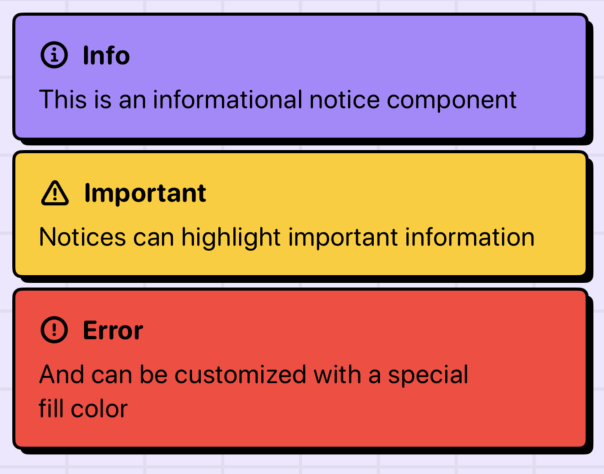
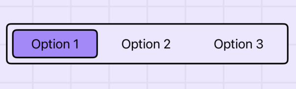
A customizable picker with brutalist styling:
@State private var selection = "Option 1"
let options = ["Option 1", "Option 2", "Option 3"]

var body: some View {
    BrutePicker(selection: $selection) {
        ForEach(options, id: \.self) { option in
            Text(option)
        }
    }
    .padding()
}
Apply themes using the .bruteTheme() modifier:
VStack {
    Text("Violet Theme")
        .bruteTheme(.violet)

    Text("Blue Theme")
        .bruteTheme(.blue)

    Text("Orange Theme")
        .bruteTheme(.orange)

    Text("Green Theme")
        .bruteTheme(.green)
}.violet- Purple/violet color scheme.blue- Blue color scheme.orange- Orange color scheme.green- Green color scheme.magenta- Magenta color scheme.maroon- Maroon color scheme.multi- Multi-color gradient theme
Create custom themes by defining color sets for light and dark modes:
let customTheme = BruteTheme(
    light: BruteTheme.ColorSet(
        foreground: .black,
        background: .white,
        // ... other colors
    ),
    dark: BruteTheme.ColorSet(
        foreground: .white,
        background: .black,
        // ... other colors
    ),
    level: 0
)

// Apply custom theme
MyView()
.bruteTheme(customTheme)Brute provides custom implementations for many SwiftUI style protocols:
// Primary button with shadow animation
Button("Press Me") { }
    .buttonStyle(.brute)

// Basic button with opacity feedback
Button("Basic") { }
    .buttonStyle(.bruteBasic)

// Neutral colors for secondary actions
Button("Secondary") { }
    .buttonStyle(.bruteNeutral)

// Reverse shadow animation
Button("Reverse") { }
    .buttonStyle(.bruteReverse)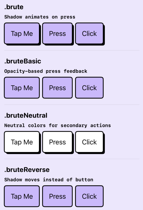
// Checkbox style
Toggle("Accept", isOn: $accepted)
    .toggleStyle(.bruteCheckbox)

// Switch style
Toggle("Enable", isOn: $enabled)
    .toggleStyle(.bruteSwitch)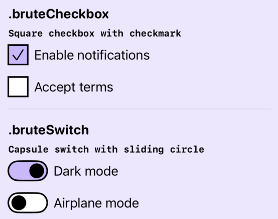
TextField("Enter text", text: $text)
    .textFieldStyle(.brute)
Note: The text field style uses private SwiftUI APIs and should be applied directly to each TextField instance.
// Determinate progress
ProgressView("Loading", value: 0.5)
    .progressViewStyle(.brute)

// Indeterminate progress
ProgressView("Loading...")
    .progressViewStyle(.brute)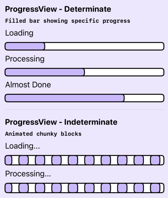
// Accent-colored badge
Label("New", systemImage: "star")
    .labelStyle(.bruteBadge)

// Neutral badge
Label("Info", systemImage: "info.circle")
    .labelStyle(.bruteBadgeNeutral)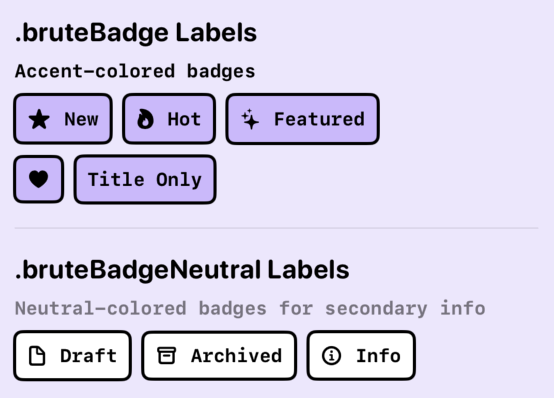
- Gauge Style:
.brute- Progress gauge with filled bar - Disclosure Group Style:
.brute- Animated expand/collapse
Apply brutalist styling to any view:
// Complete brutalist treatment
MyView()
    .brutalized()

// With custom background
MyView()
    .brutalized(with: .red)

// Individual modifiers
MyView()
    .bruteClipped()      // Rounded corners
    .bruteStroked()      // Border stroke
.bruteShadow() // Offset shadowThemes support hierarchical levels for nested components:
VStack {
    Text("Level 0")
        .bruteTheme(.violet)

    VStack {
        Text("Level 1 - Darker variation")
    }
    .bruteTheme(.violet, level: 1)
}Access theme values directly in custom views:
struct CustomView: View {
    @Environment(\.bruteContext) private var context

    var body: some View {
        Text("Custom")
            .foregroundStyle(context.color.accentForeground)
            .padding(context.dimen.paddingMedium)
            .font(context.font.title)
    }
}For detailed documentation of all components, styles, and modifiers, see the inline documentation in the source code.