


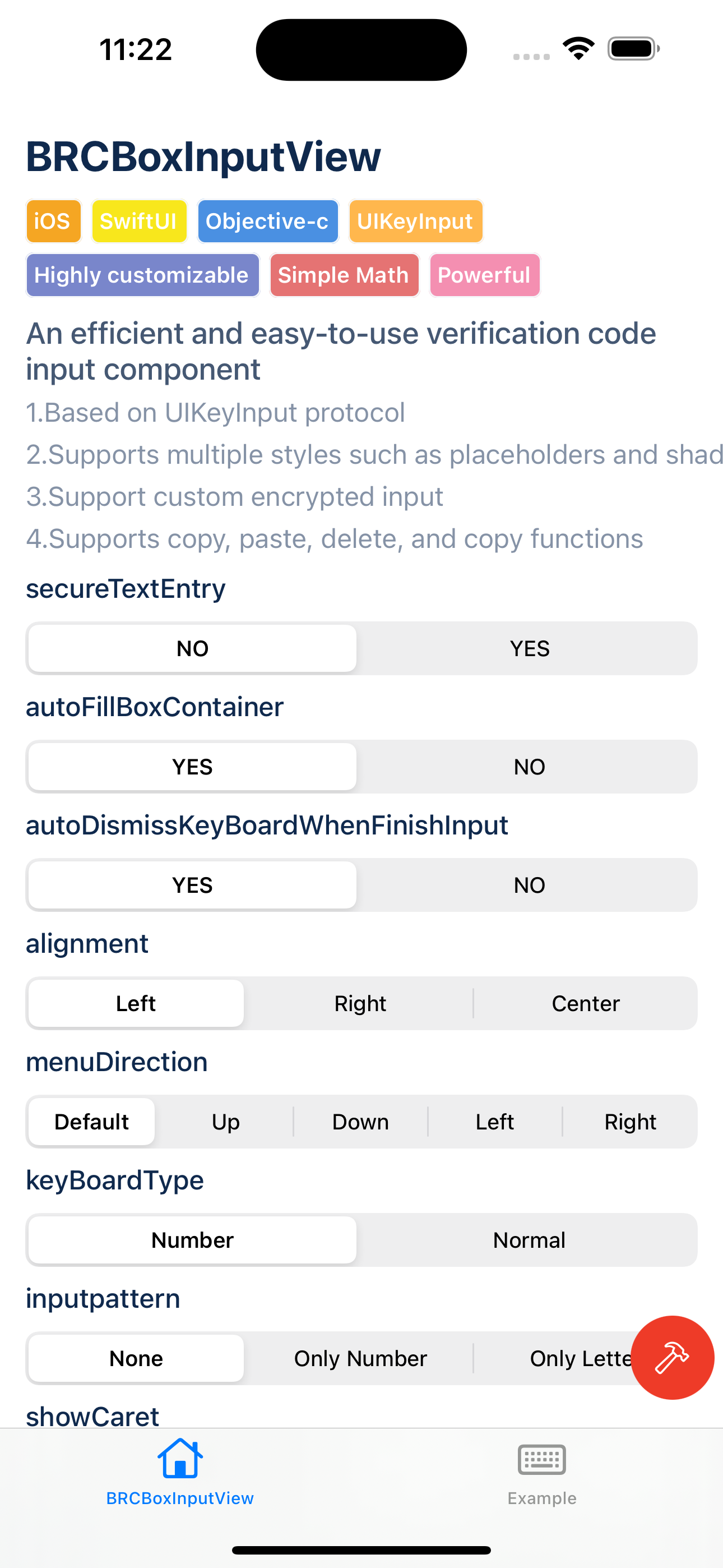
A versatile, highly customizable input view for iOS. It supports various text input customizations, including keyboard settings, caret styles, box alignment, and input length constraints. The view conforms to the UITextInput protocol and offers a flexible, user-friendly text input experience suitable for a wide range of applications.
| BaseInput | CustomInput |
|---|---|
|
|
-
Multi-platform/multi-framework support
SupportsUIKit, SwiftUIframework andOC, Swifttwo languages -
Based on UITextInput protocol Supports various text input customizations, the code is efficient, concise and non-invasive, and there is no need to create a UITextField / UITextView view to complete the input.
-
Cursor customization Control the appearance and behavior of the cursor, including width, height, blink duration, and opacity.
-
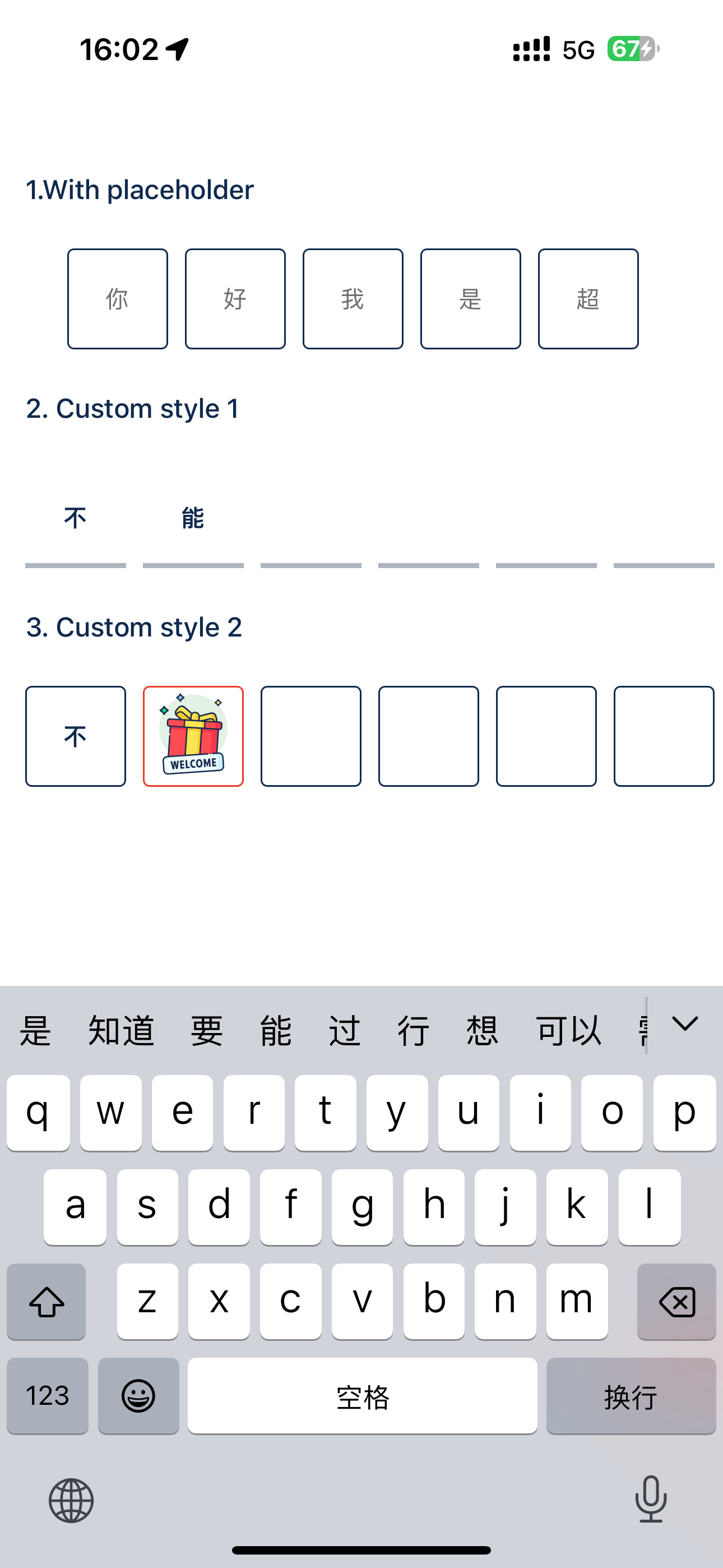
Box style customization Customize the appearance and alignment of input boxes, including the space between boxes, selection transition duration, and autofill options. It also supports inheritance to meet highly customized needs.
-
Menu operation Supports copy, paste, cut and delete operations in input views.
objective-c
#import "BRCBoxInputView.h"
BRCBoxInputView *view = [[BRCBoxInputView alloc] initWithInputLength:8];
[self.view addSubview:view];
swift
import BRCBoxInputView
let boxInputView = BRCBoxInputView(inputLength: 10);
addSubview(boxInputView);
swift-ui
import BRCBoxInputView
BRCBoxInput<BRCBox>(text: $boxInputText,isFocus: $isBoxInputFocus)
  .inputLength(8)
.frame(height: 80)Note
BRCBoxInputView provides many custom parameters. Learning to use these parameters correctly will help you use this component better.
Q: I want to customize the input style of the input box, how should I set the parameters
A:
-
Basic properties:
boxSpace,boxSize,inputMaxLengthThrough these parameters, you can set the distance between each input box, the size of the input box and the maximum number of input boxes -
Advanced properties:
boxStyleis the style of the input box in its normal state. It internally supports setting text/placeholder styles and styles such ascornerRadius / border / shadow / background-color / foreground-colorselectedBoxStyleis the style when the input box is selected. It internally supports setting text/placeholder styles and styles such ascornerRadius / border / shadow / background-color / foreground-colorWhether
autoFillBoxContainerautomatically fills the entire input box view. When this property is set totrue, you do not need to set the parameterboxSize, and the internal calculation will be performed to adapt the setting ofboxSize -
How to use:
In addition to supporting directly setting properties such as
boxStyleandselectedBoxStyle, we also support customizing the style of each input box in different states through callbacks. You need to set thedelegateparameter and implement the following methods to implement different input boxes. Rich styles in different states
- (BRCBoxStyle *)boxStyleWithIndex:(NSInteger)index withBoxView:(BRCBoxView *)boxView inInputView:(BRCBoxInputView *)inputView {

}
Q: I want to customize the input cursor style, how should I set the parameters?
A:
caretWidth, caretHeight, caretMaxOpacity, caretMinOpacity, blinkDuration, caretTintColor, showCaret Through these parameters, you can customize the width and height of the cursor, color and cursor animation duration, maximum / Minimum transparency
Q: I want the input box to be able to copy, paste, cut, delete, etc. How should I set it up
A:
menuActions By setting this parameter, you can decide which clipboard methods the input box responds to. Currently, four methods of copy, paste, cut, and delete are supported in response to the input box, and all of them have been internally adapted
menuDirection determines the direction of the menu popup
Q: I want to customize the encryption style of the input box. How should I set the parameters?
A:
secureTransitionDuration, secureDelayDuration By setting these parameters, you can determine the transition duration and delayed display duration of the encryption style.
Q: I want to customize the keyboard and interaction style of the input box. How should I set the parameters?
A:
- Basic parameters:
contentType,keyboardType,returnKeyTypeBy setting these parameters, you can set the keyboard, content, and keyboard return button style of the input box - Advanced parameters:
autoDismissKeyBoardWhenFinishInput: Whether to automatically close the keyboard when the input is completed. When the input characters in the input box reachinputMaxLength, the keyboard will be automatically closedfocusScrollPosition: When too muchinputMaxLengthis set, the interior will become a slideable view. When input is entered into an input box that exceeds the user view, the interior will automatically scroll to the current input view. You can choose to scroll. Go to the left/middle/right side of the current input viewonClickInputViewBlock: The operation performed by clicking on the input box view. By default, clicking on the input box will reverse the current keyboard display
Q: I want to customize the content of the input box, how should I set the parameters?
A:
- Basic parameters:
placeHolder,textYou can use these parameters to set the text/placeholder of the input box - Advanced parameters:
alignmentis the alignment style of the input box. When the length of the input box is relatively short and the width of the given container is relatively long, you may need to set its alignment at this time, such as left-aligned/center-aligned/right-alignedinputPatternRegular input filtering of the input box. You can set this attribute to ensure that the content entered in the input box is the text you want
Q: Why do the set parameters not take effect?
A:
The property setting methods have been rewritten internally, but there may be a small number of times when the properties are updated frequently, and the style may not be updated. Therefore, we recommend calling the -reloadView: method when completing the properties. to reload the view, ensuring that the view's style is exactly the same as what you set
Q: I want to rewrite the Box of the input box to achieve a highly customized style. How should I do it?
A:
1.UIKit
Method 1
- First you need to write a
Viewthat inherits theUICollectionCellclass or inheritsBRCBoxViewto complete your highly customized needs for the view.- It is recommended that your view needs to follow the
BRCBoxViewProtocolprotocol and implement the protocol methods, so that you can quickly and efficiently build your input box style.
Method 2
- First you need to write a
Viewthat follows theBRCBoxViewProtocolprotocol and implement the protocol methods, so that you can quickly build the input box style- Set the
delegateattribute, implement the following methods indelegate, and return to your input box
- (UIView<BRCBoxViewProtocol> *)boxWithIndex:(NSInteger)index inInputView:(BRCBoxInputView *)inputView {

}
2.SwiftUI
- You need to customize a view to follow the two protocols
View, BRCBoxProtocol, and implement the methods in the protocols at the same time- You need to specify your Box type and implement the
-customBoxView:method when using it, as shown below
BRCBoxInput<CustomBoxView>(text: $text, isFocus: $isFocus)
      .customBoxView { index, isSelect, boxSize in
          CustomBoxView(text:character(at: index, in: text),isSelected:isSelect,boxSize:boxSize)
      }
.frame(height: 80)Note
BRCBoxInputView has expanded and supported SwiftUI after version v1.2.0. If you need to use this component in SwiftUI, please upgrade to version > v1.2.0
1. Level of support
Currently, SwiftUI already supports all parameters of the component. You only need to introduce BRCBoxInputView to call the component.
2.Advanced use
Since SwiftUI does not support a type directly inherited from UIKit, in order to adapt to the needs of custom input box views, we have bridged it between UIView and View, and the caller does not need to pay attention to it. During the conversion process, you only need to follow the new protocol BRCBoxProtocol and implement the protocol methods to customize the style of the input box.
BRCBoxInputView is available through CocoaPods. To install it, simply add the following line to your Podfile:
pod 'BRCBoxInputView'iOS 13.0+ Xcode 12+
- iOS 13.0
- Xcode 12+
zhixiongsun, sunzhixiong91@gmail.com
BRCBoxInputView is available under the MIT license. See the LICENSE file for more info.