
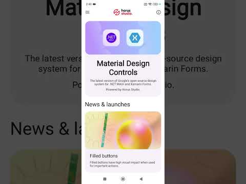
MaterialDesignControls for .NET MAUI, provides a collection of UI controls that follow Material Design 3 Guidelines.
- Demo
- Platform support
- Setup
- Getting started
- Controls
- Styles
- Configurations
- Samples
- Release notes
- Developed by
- Contributions
- License
MaterialDesignControls Plugin provides cross-platform controls for:
- Android
- iOS
- macOS
- Windows (upcoming)
- Available on NuGet
dotnet add package HorusStudio.Maui.MaterialDesignControlsIn order to use MaterialDesignControls, you need to register it into your MauiAppBuilder on MauiProgram.cs file:
var builder = MauiApp.CreateBuilder();
builder
    .UseMauiApp<App>()
    .UseMaterialDesignControls(options =>
    {
        ...
    });
and initialize components after your Application has been initialized on App.xaml.cs:
public App()
{
    InitializeComponent();
    MaterialDesignControls.InitializeComponents();
    ...
}
To add controls to your views, you need to add this namespace on your XAML:
...
xmlns:material="clr-namespace:HorusStudio.Maui.MaterialDesignControls;assembly=HorusStudio.Maui.MaterialDesignControls"
...


<material:MaterialButton ... />
...- MaterialBadge
- MaterialButton
- MaterialCard
- MaterialCheckbox
- MaterialChips
- MaterialChipsGroup
- MaterialDatePicker
- MaterialDivider
- MaterialFloatingButton
- MaterialIconButton
- MaterialLabel
- MaterialMultilineTextField
- MaterialNavigationDrawer
- MaterialPicker
- MaterialProgressIndicator
- MaterialRadioButton
- MaterialRating
- MaterialSelection
- MaterialSlider
- MaterialSwitch
- MaterialSnackbar
- MaterialTextField
- MaterialTimePicker
- MaterialTopAppBar
- MaterialViewButton
- MaterialBottomSheet
- MaterialCodeEntry
- MaterialDialog
- MaterialDoublePicker
- MaterialSearch
- MaterialSegmentedButton
MaterialDesignControls define several Helpers with default configuration for colors, font sizes, font families, and other global styles to be applied on every control:
- MaterialAnimation
- MaterialLightTheme
- MaterialDarkTheme
- MaterialElevation
- MaterialFontFamily
- MaterialFontSize
- MaterialFontTracking
- MaterialIcon
- MaterialFormat
You can override those defaults following too different approaches, one entirely on C# code, and the other using ResourceDictionaries.
var builder = MauiApp.CreateBuilder();
builder
    .UseMauiApp<App>()
    .UseMaterialDesignControls(options =>
    {
        // Enable library logs for debug purposes
        options.EnableDebug();

        // Get exceptions caught by library so you can track them on your sources or do as you need
        options.OnException((sender, exception) =>
        {
            System.Diagnostics.Debug.WriteLine($"EXCEPTION ON LIBRARY: {sender} - {exception}");
        });

        ...
    });
If you're using custom fonts on your app, you can register them into MaterialDesignControlsBuilder instead of MauiAppBuilder and they will be automatically registered on your Application either way. Also, you need to indicate MaterialDesignControls library which Font is Regular, Medium and Default one to use.
    .UseMaterialDesignControls(options =>
    {
        ...

        options.ConfigureFonts(fonts =>
        {
            fonts.AddFont("Roboto-Regular.ttf", "RobotoRegular");
            fonts.AddFont("Roboto-Medium.ttf", "RobotoMedium");
            fonts.AddFont("Roboto-Bold.ttf", "RobotoBold");
        }, new("RobotoRegular", "RobotoMedium", "RobotoRegular"));

        ...
}); .UseMaterialDesignControls(options =>
{
...
options.ConfigureThemes(
lightTheme: new MaterialTheme
{
Primary = Colors.Blue,
OnPrimary = Colors.LightBlue,
...
},
darkTheme: new MaterialTheme
{
Primary = Colors.SkyBlue,
OnPrimary = Colors.DarkBlue,
...
});
...
}); .UseMaterialDesignControls(options =>
{
...
options.ConfigureFontSize(new MaterialSizeOptions
{
BodyMedium = 18,
LabelLarge = 15,
...
})
...
}); .UseMaterialDesignControls(options =>
{
...
options.ConfigureFontTracking(new MaterialSizeOptions
{
BodyMedium = 0.35,
LabelLarge = 0.2
...
})
...
}); MaterialDesignControls use default icons for MaterialPicker, MaterialDatePicker and MaterialTimePicker. It also uses a default icon for Error state on each MaterialInputBase. You can override partially or totally default icons by configuring:
    .UseMaterialDesignControls(options =>
    {
        ...

        options.ConfigureIcons(new MaterialIconOptions
        {
            Picker = "ic_expand.png",
            Error = "ic_error.png",
            DatePicker = "ic_date.png",
            TimePicker = "ic_date.png"
        });

        ...
}); You can, also override default string format(s) for MaterialDatePicker and/or MaterialTimePicker by configuring:
    .UseMaterialDesignControls(options =>
    {
        ...

        options.ConfigureStringFormat(new MaterialFormatOptions
        {
            DateFormat = "dd/MM/yyyy",
            TimeFormat = "t"
        });

        ...
}); If you have all your resources (Colors, sizes, etc) on ResourceDictionaries, you can override everything detailed above as well without C# code. Library will look for resources named exactly as properties defined on MaterialDesignControls configuration. Each Helper let you indicate, optionally: ResourceDictionary file containing configurations (will inspect all MergedDictionaries if not provided), prefix for those resources if needed.
    .UseMaterialDesignControls(options =>
    {
        ...
        options.ConfigureThemesFromResources("MyResources.xaml", "MaterialLight", "MaterialDark");
        ...
        options.ConfigureFontSizeFromResources("MyResources.xaml", "MaterialSize");
        ...
        options.ConfigureFontTrackingFromResources("MyResources.xaml", "MaterialTracking");
        ...
        options.ConfigureIconsFromResources("MyResources.xaml");
        ...
        options.ConfigureStringFormatFromResources("MyResources.xaml");
        ...
}); Find more usages and samples on our sample app.
Check out our progress here.
Contributions are welcome! If you find a bug and/or want a feature added please report it.
If you want to contribute code please file an issue, create a branch, and file a pull request.
MIT License.