Add dropdown menu to show extra figure information #1570
Conversation
|
Thanks for kicking this off @bazzadp! This flew under my radar but I completely agree this would be great to have at launch. Here are some disorganized design suggestions for you or whoever wants to take this on:
|
Yeah been in my to do list once I got templates in place I wanted them (now done!). And was wondering if the templates would put some people off so thought if I tackled that (the easy bit IMHO!) then others can then build it and do the hard, styling piece 😀 Luckily it’s very little change so far, as you can see from the PR so hopefully if we can make the styling changes over next few days, it’ll be low risk enough to launch because I think it would be great addition.
Yeah I see that’s how it’s done in httparchive.org and only reason I didn’t do it there was because of tables. But absolutely, let’s look at this again once we get it looking prettier than what it does now.
100% agree.
Yeah I’m in two minds myself. I do think pop up menus on mobile aren’t great UX and How do you feel about having it on big figures (example)? Overkill or useful? Guess it depends if we can make the design subtle enough that it doesn’t distract from that. |
It should be on all figures sourced from HA data, regardless of type, since readers should always have a way to drill down into the results and the queries that generated them. For that to work in practice, the buttons should be unobtrusive, especially because they're visible on every figure. To help readers know it's there but not get distracted by it, I think a combination of iconography (dots/burgers) and removing the default button border could help it blend in more seamlessly. |
|
Is there anyone on @HTTPArchive/developers who can bring this over the finish line before the launch next week? |
|
I'll work on this |
|
Current version
Would love advice on:
|
|
Thanks so much @rviscomi for getting this to this much better state!
I'm still not 100% convinced the top right is the correct location. Not sure it works for any of our three figure types to be honest:
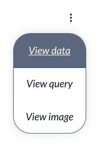
Sure I can't persuade you to have it as part of the figure caption where it could be consistent for all? Something like this:
Added this in 823fb3a. What do you think?
(Note blue line only appears of keyboard focus and not on mouse hover)
Fixed in d3bcd5e. Was due to use of SVG in the button
Had a play with this and proving a bit tricky as it's a button whereas other elements are links. Don't you think this will be a bit odd? Not loving the interaction of a button within a button, nor of hiding this so far away.
I'm not sure we should do this. Won't that defeat much of the point of having this? You don't do this on the menus on https://httparchive.org/reports/state-of-the-web for example? Also quite concerned with doing this AND hiding the description button in the menu. We put a lot of effort into these descriptions and so hiding them away, where you need either keyboard focus or hover concerns me.
I think it's pretty accessible because we used our standard drop down. I did however add |
I'd like to start with it in the top right corner and I'm be open to revisiting its positioning after launch.
I think it's ok.
I'm willing to drop the hidden until visible request. Your style suggestions LGTM. I'll approve and you can merge if you think this is good to go. |
|
I haven't addressed your table issue btw, as was waiting to see what you thought about moving to figcaption. Though couldn't repeat it myself to be honest so maybe not that common. Still OK to merge or wanna have another look at that? |
|
I'd prefer to merge what we have and also get a feel for it in action on the 2020 figures before iterating further. |
|
SGTM! |
Closes #1138
@HTTPArchive/developers this is one I'd like to see if we can squeeze in before launch if we can.
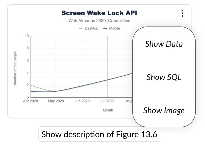
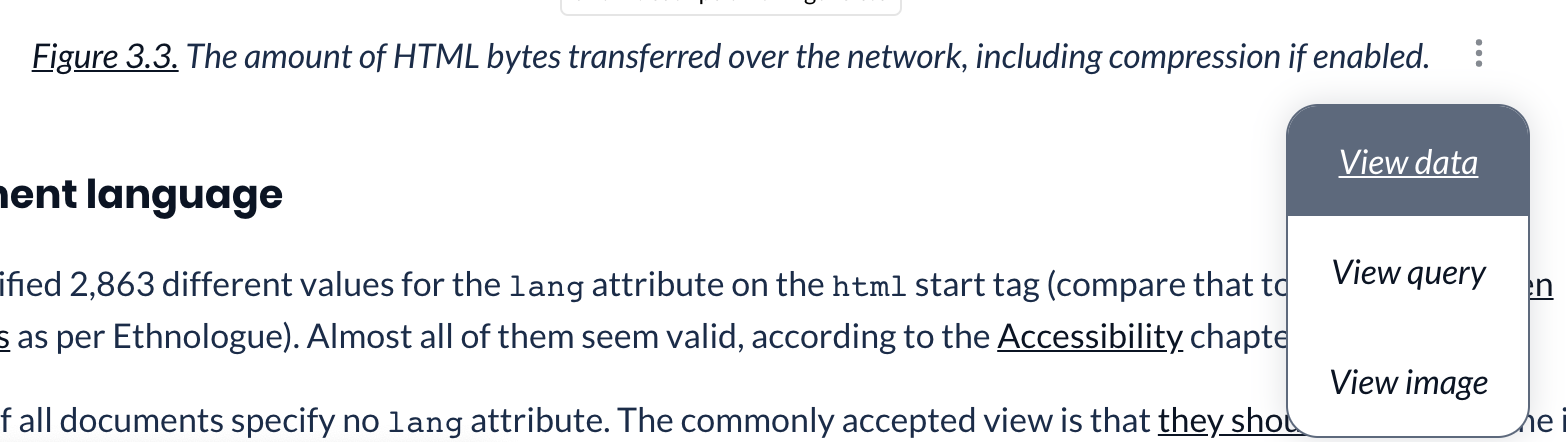
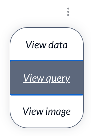
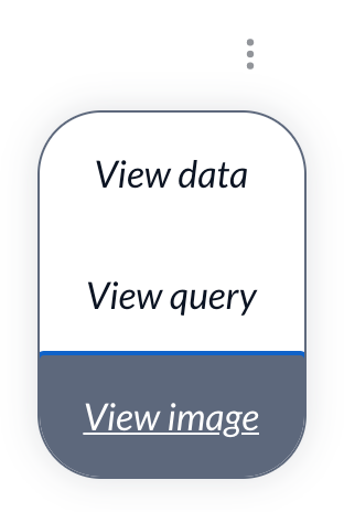
This adds a drop down menu besides each figure which has SQL, Sheets or Image data:
Which when opened gives a list of links:
This allows readers to more easily explore the data and opens up the HTTP Archive to newcomers, which is a key aim of the project.
Like our other menu, this defaults to a
<select>element on mobile for ease of use, and it also works on tables and big-figures:There's a test release here so you can play with it: https://20201123t164931-dot-webalmanac.uk.r.appspot.com/en/2020/capabilities#fig-2
Now it's functional but obviously it looks absolutely awful, so we can't launch this. My CSS ain't great and after spending a small bit of time trying to hack this to get the menu to escape it's parent's confides and failing miserably, I've decided to ask for help, instead of trying to stumble a monstrosity across the finish line myself.
Are there any CSS wizards out there with a design eye that could finish off the design here? I'm happy to help with the HTML and templating for the functional side so it would be a collaboration between us.
I also need to internationalise the wording in the templates, but I can take care of that afterwards as know the templates really well. Just need help with the CSS.
Any takers? @catalinred you've a good eye and have done some great CSS work on the Almanac before so would love your help here. Or anyone else.