-
Notifications
You must be signed in to change notification settings - Fork 2.9k
New issue
Have a question about this project? Sign up for a free GitHub account to open an issue and contact its maintainers and the community.
By clicking “Sign up for GitHub”, you agree to our terms of service and privacy statement. We’ll occasionally send you account related emails.
Already on GitHub? Sign in to your account
Moderation Help Article #22921
Moderation Help Article #22921
Conversation
|
@eVoloshchak Please copy/paste the Reviewer Checklist from here into a new comment on this PR and complete it. If you have the K2 extension, you can simply click: [this button] |
|
@jliexpensify I modified the screenshots slightly but I think this works. I also added one sentence to clarify that you get a whisper when you flag a piece of comment as well as if you are flagged. Let me know what you think (screenshots in description) Also @shawnborton lemme know if you see anything that you'd like to fix. Thanks! |
|
I think it looks good @dangrous - the only thing I noticed was the border around the phone: @shawnborton might have some thoughts, but I personally think it's a little jarring - I think removing the shadow around the phone would look better. Also, it looks like these corners are sharp, compared to the 4th which is rounded: does that need to be fixed? |
|
Ha yes those are my poor image combining skills - maybe @shawnborton would have a moment to fix them? The rounded vs. straight corners is simply because that one rounded one is an app edge, and the others are me cropping the screenshot. There's probably a nicer way to do this |
|
Yeah, it will be nice to standardize on how we mock up phone + chat room content. So perhaps I just need to get you a better mockup for this one and we can go from there? |
|
That would be lovely @shawnborton! Let me know if I can help at all. Also to note - right now there isn't a super clean way in the code to put two images on the same line in the help docs, so that's why (you can see in the PR) I combined them into one. Another consideration for the mockups! |
|
Cool, I can come up with a way to display both at the same time. |
|
Hey @shawnborton I know you're busy with a lot of other projects (and this is pretty lo pri) but lemme know when you've got the new assets and I can update! |
|
My bad, I should be able to get this to you today! |
|
Looks great Shawn! |
|
That looks lovely! |
|
I think for consistency's sake, they should mirror what @shawnborton has done with the other images |
|
Agree, happy to add the border to them so they look similar. Can you provide the raw screenshots and I can resize/adjust from there? |
|
Top one is lovely! For the bottom two, we're only really interested in the chat portion, or even - if we drill down more - the Concierge message itself. Would it make sense to crop those in even more? |
|
ah, perfect! I'll use these ones (unless GH downrezzes them but I don't think so?) Thanks for the assist! |
|
Give it a shot and let's see how it goes. |
|
Updated to use new images! I also found a bug where in Firefox these images display way too large (cut off on the right) so I fixed that here and in the other page that uses large screenshots like this. |
|
Bump for review when you have a moment, @eVoloshchak! |
Reviewer Checklist
Screenshots/VideosWebMobile Web - ChromeMobile Web - SafariDesktopiOSAndroid |
|
@dangrous, are the images supposed to be visible on GitHub? Here's how it looks in browser and vscode preview 
|
| @@ -100,7 +100,7 @@ This is essentially like setting a daily or individual expense limitation on any | |||
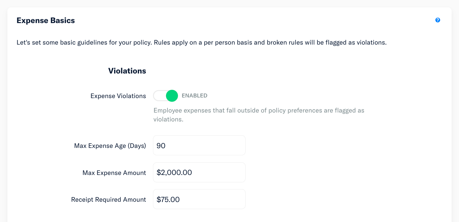
| *Receipt Required Amount: $75* | |||
| Receipts are important, and in most cases you prefer an itemized receipt. However, Expensify will generate an IRS-compliant electronic receipt (not itemized) for every expense not tied to hotels expense. For this reason, it’s important to enforce a rule where anytime an employee is on the road, and making business-related purchases at hotel (which happens a lot!), they are required to attach a physical receipt. | |||
|
|
|||
|  | |||
| {:width="100%"} | |||
There was a problem hiding this comment.
Choose a reason for hiding this comment
The reason will be displayed to describe this comment to others. Learn more.
There was a problem hiding this comment.
Choose a reason for hiding this comment
The reason will be displayed to describe this comment to others. Learn more.
hm, just this one? Or all of them? If all of them, I think it may be a limitation of the markdown - vs. the actual jekyll server. Were you trying the server or just the markdown?
There was a problem hiding this comment.
Choose a reason for hiding this comment
The reason will be displayed to describe this comment to others. Learn more.
Or all of them?
It's all of them
Were you trying the server or just the markdown?
I'm just looking at how it looks in GitHub preview (example)
Yes sorry to test it you'll have to change it to |
Ah, I see now, thank you! |
|
Let me know if you're still having trouble @eVoloshchak ! |
|
@dangrous, the GitHub preview is still displaying the |
|
Yeah I don't think the markdown previews on their own will show correctly - you'll need to follow the instructions here to set it up locally - https://github.com/Expensify/App/blob/main/docs/README.md - (and then change those image URLS to |
|
@dangrous, thank you, all working and looking good now |
|
🎯 @eVoloshchak, thanks for reviewing and testing this PR! 🎉 An E/App issue has been created to issue payment here: #24362. |
There was a problem hiding this comment.
Choose a reason for hiding this comment
The reason will be displayed to describe this comment to others. Learn more.
LGTM! I noticed we didn't test on mobile, though. Is that something we can do?
|
Hmm, the screenshots aren't super visible on mobile but I guess since the user can probably open up the image in a new tab, it should be fine? What do you think, @shawnborton? |
|
Yeah, I think that's probably okay? Or we can change up the asset or serve up different assets for mobile entirely? |
|
I also don't mind just getting this out and optimizing at a later date. |
There was a problem hiding this comment.
Choose a reason for hiding this comment
The reason will be displayed to describe this comment to others. Learn more.
LGTM! I'm on board with optimizing for mobile later.
|
✋ This PR was not deployed to staging yet because QA is ongoing. It will be automatically deployed to staging after the next production release. |
|
🚀 Deployed to staging by https://github.com/MariaHCD in version: 1.3.54-0 🚀
|
1 similar comment
|
🚀 Deployed to staging by https://github.com/MariaHCD in version: 1.3.54-0 🚀
|
|
🚀 Deployed to production by https://github.com/yuwenmemon in version: 1.3.54-13 🚀
|


@jliexpensify and @shawnborton please review for visuals and content!
Details
Adds info about moderation to our help docs
Fixed Issues
$ https://github.com/Expensify/Expensify/issues/281503
Tests
Offline tests
QA Steps
PR Author Checklist
### Fixed Issuessection aboveTestssectionOffline stepssectionQA stepssectiontoggleReportand notonIconClick)myBool && <MyComponent />.src/languages/*files and using the translation methodWaiting for Copylabel for a copy review on the original GH to get the correct copy.STYLE.md) were followedAvatar, I verified the components usingAvatarare working as expected)/** comment above it */thisproperly so there are no scoping issues (i.e. foronClick={this.submit}the methodthis.submitshould be bound tothisin the constructor)thisare necessary to be bound (i.e. avoidthis.submit = this.submit.bind(this);ifthis.submitis never passed to a component event handler likeonClick)StyleUtils.getBackgroundAndBorderStyle(themeColors.componentBG))Avataris modified, I verified thatAvataris working as expected in all cases)ScrollViewcomponent to make it scrollable when more elements are added to the page.mainbranch was merged into this PR after a review, I tested again and verified the outcome was still expected according to theTeststeps.Screenshots/Videos
Web
Mobile Web - Chrome
Mobile Web - Safari
Desktop
iOS
Android