Flexbox makes designing and coding responsive websites a breeze. In the reading, we went over how to use flexbox properties on parent and children elements. Now that you're a pro at using flexbox, go on and flex your CSS skills! (Please pardon the pun).
In this practice, you'll use flexbox to recreate the Trello dashboard so that it's responsive to different screen sizes.
Clone the practice from the starter.
Once you're in VS Code, you can drag the index.html file into your browser to view the webpage, or use the File Explorer to open it in your browser. The only file you will need to edit for this practice is main.css.
Remember to save the CSS file and refresh the page in the browser whenever you make changes.
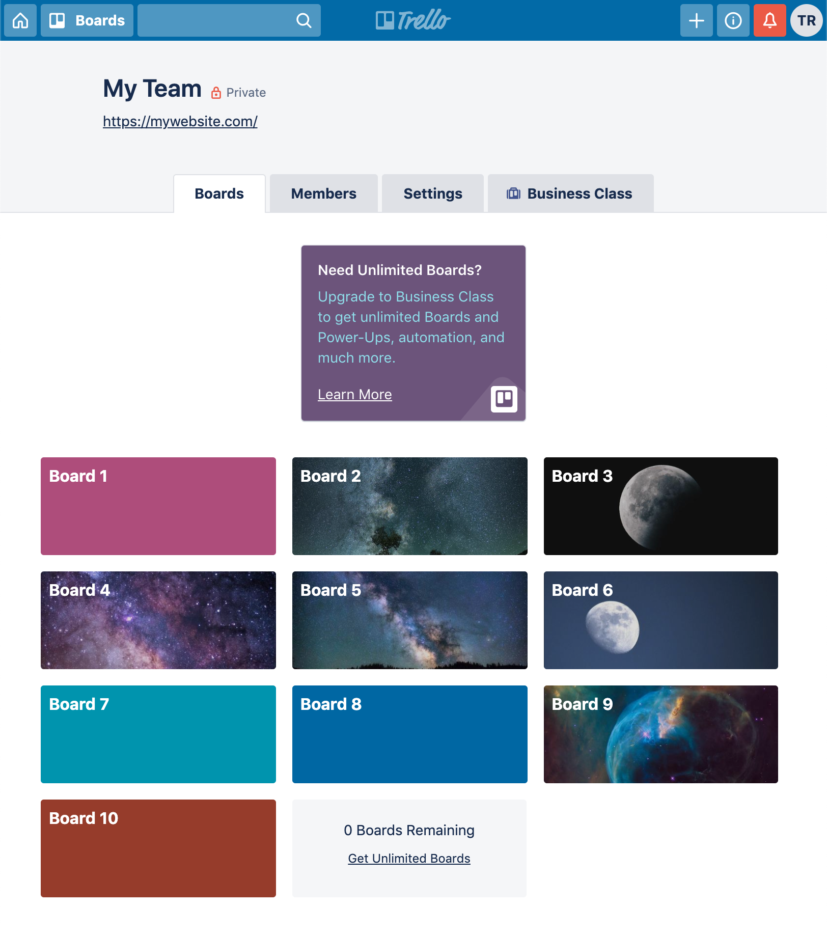
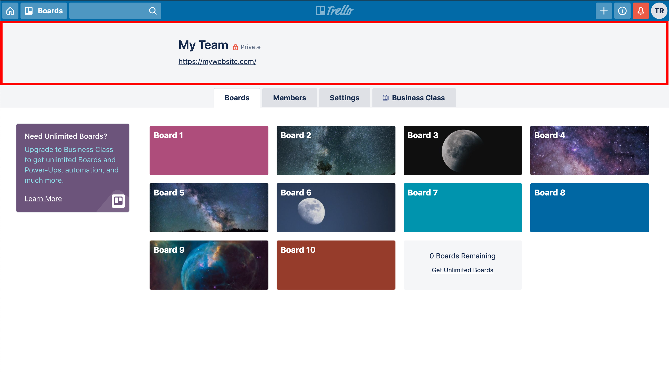
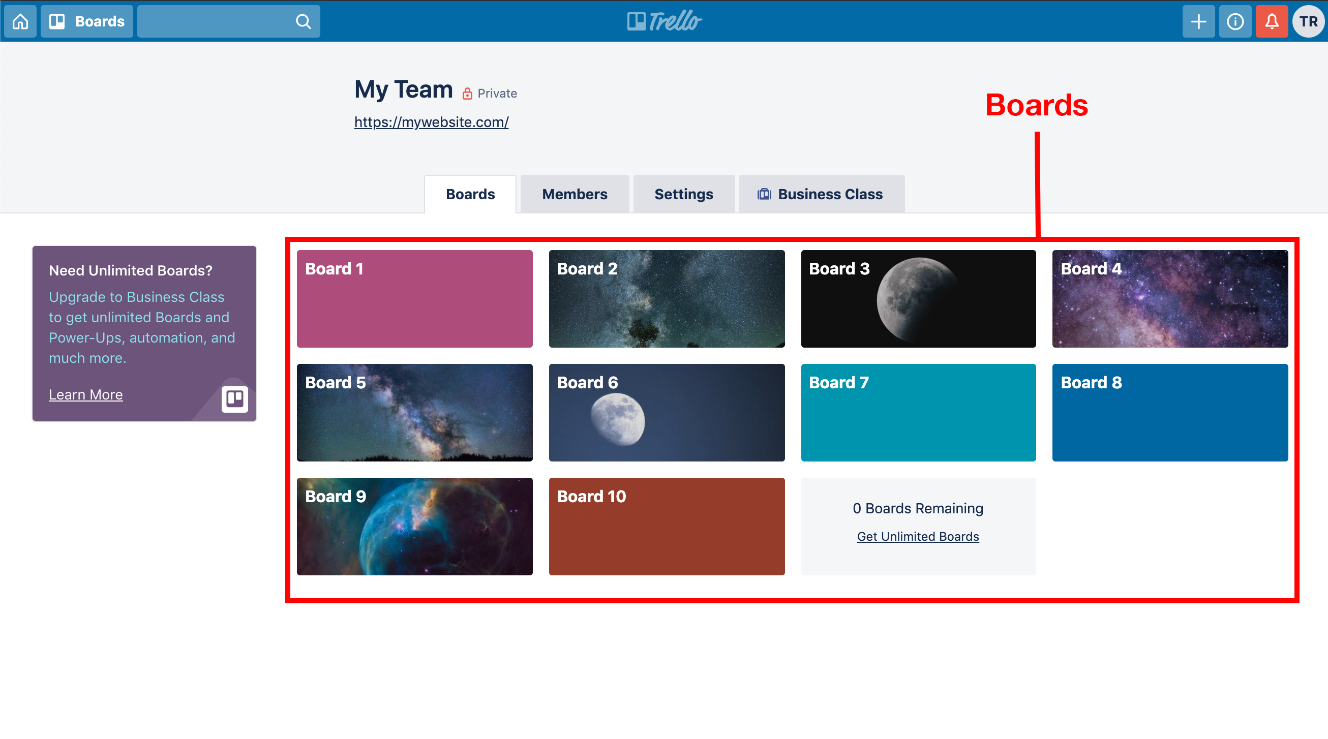
Trello is a Web application that many professionals use to manage projects. In this project, you will use flexbox to recreate the Trello dashboard page depicted in the following screenshots.
Screenshot of page in large screen (desktop) format:

Screenshot of page in medium screen (desktop/tablet) format:
Screenshot of page in small screen (mobile) format:

All of the elements needed for the page are contained in the
index.html file. You will have to link to main.css, where you'll add your
styles (try adding a background-color to the .header-nav__container to see
if the import was successful). The page also includes a CDN link to Font
Awesome, a font that contains nice icons you can use for the header. To use an
icon from Font Awesome, you just need to include an i element with the classes "fa«indicator»" and "fa-«icon name»". For example, to include the solid "home"
icon which looks like a house, you would add this HTML to your source code.
<i class="fas fa-home"></i>The "fas" means "Font Awesome Solid!" So easy! Here's a link to the Font Awesome free icon search page so you can have it open if you want to include more icons.
Use flexbox to recreate the blue header nav bar at the top of the page. Try to replicate the header so it's as close to what's on the site/screenshots as possible. We have included icons, which are similar to the original icons, for you to use in your project folder.

Start off by setting the page-wide style on the body element. Set the
following properties for it.
| Property | Value |
|---|---|
| Font family | 'Segoe UI', 'Roboto', 'Noto Sans', 'Ubuntu', 'Droid Sans', 'Helvetica Neue', sans-serif |
| Font size | 14 pixels |
| Margin is | 0 pixels |
Style the .header-nav__container with the following properties. The third
entry in the table, "Line height", use MDN to figure out what that CSS property
is for that setting.
| Property | Value |
|---|---|
| Background color | #026AA7 |
| Font size | 16 pixels |
| Line height | 20 pixels |
| Padding | 4 pixels |
| Text color | white |
Now, you'll need to use display: flex on the header-nav__container to put
the three sections in the right place with space between them. (The trello logo in the center and
the buttons to the left and right.)
Then for all the .header-nav__group, you'll want to manipulate the margin and padding to get the
different elements spaced apart from one another.
In the right .header-nav__group, the alert button should have a background color of
"#CF513D".
Once you have that, add a media query "breakpoint" to hide the search input field and the "Boards" text on screens with widths less than or equal to 730 pixels.
@media screen and (max-width: 730px) {
  /* Hide the header search input field. */
  /* Hide the "Boards" text, but leave the boards icon. */
}Use flexbox to recreate the "My Team" section under the header nav bar.
Set the following properties to the indicated values for .team__container:
| Property | Value |
|---|---|
| Background color | #f4f5f7 |
| Padding | 32 pixels |
Set the following properties to the indicated values for .team__info:
| Property | Value |
|---|---|
| Flex direction | column |
| Margin | 0 auto |
| Max width | 650 pixels |
| Text alignment | center |
Set the following properties to the indicated values for H1 elements that are a
direct child of .team__info:
| Property | Value |
|---|---|
| Margin | 0 0 12px |
| Font size | 24 pixels |
| Font weight | 600 |
| Line height | 28 pixels |
Set the following properties to the indicated values for A elements that are
descendants of .team__info:
| Property | Value |
|---|---|
| Text color | #172b4d |
| Line height | 20 pixels |
| Font weight | The normal font weight |
Use flexbox to recreate the tabbed nav bar above the boards, which contains four links -- Boards, Members, Settings, Business Class.

Set the following properties to the indicated values for
.tabbed-nav__container:
| Property | Value |
|---|---|
| Background color | #f4f5f7 |
Set the following properties to the indicated values for .tabbed-nav__group:
| Property | Value |
|---|---|
| Bottom border | 1px solid #dfe1e6 |
| Display | flex |
| Justify content | center |
Set the following properties to the indicated values for .tabbed-nav__link:
| Property | Value |
|---|---|
| Background color | white |
| Border | 1px solid #dfe1e6 |
| Border bottom | 0 |
| Border radius | 2 pixels |
| Font weight | Bold weight |
| Line height | 20 pixels |
| Padding | 10 pixels |
| Margin | 0 5px |
| Text color | #172b4d |
Add a media query that applies to screens with widths greater than 500 pixels.
Use flexbox to handle the layout of the children of .tabbed-nav__group. Make
sure they're aligned and centered.
Now, for the screens less than or equal to 500 pixels wide, add a media query
that applies to that subfeature. In that media query, set the display of the
.tabbed-nav__group and any .tabbed-nav__link to "block". This will make the
tabs look stacked on small screens rather than horizontal on screens wider than
500 pixels.
For the boards, there is a collection of ten images in the board-backgrounds directory of the project. You can set the background image of each element individually since each has a unique class on it. It will look something similar to the following, though the images will differ.
Set the following properties to the indicated values for the
.boards__container:
| Property | Value |
|---|---|
| Margin | 0 auto |
| Padding | 32 pixels |
| Maximum width | 1400 pixels |
The .boards__container should use flexbox, so set the display appropriately.
It should also have a horizontal flex direction and have wrapping enabled.
Set the following properties to the indicated values for the .boards__sidebar:
| Property | Value |
|---|---|
| Background color | #6C547B |
| Border radius | 3 pixels |
| Margin | 0 32px 32px 0 |
| Padding | 0 20px 32px 20px |
| Maximum height | 130 pixels |
| Maximum width | 180 pixels |
| Width | 20% |
The .boards__sidebar, as a child in a flexbox layout, should indicate that it
should not grow or shrink. It should have a basis of 220 pixels.
The .title and a elements that are descendants of .boards__sidebar-content
should have white text color.
The .description elements that are descendants of .boards__sidebar-content
should have light blue text color. (There is a named color for light blue.)
The .boards__group should also be a flexbox container that allows its child
elements to wrap. It should have a width of 80%.
Set the following properties to the indicated values for the .boards__board:
| Property | Value |
|---|---|
| Background color | hotpink |
| Border radius | 3 pixels |
| Box sizing | border box |
| Font weight | bold font |
| Height | 100 pixels |
| Margin | 0 8px 16px |
| Maximum width | 250 pixels |
| Padding | 4px 8px |
| Position | relative |
| Text color | white |
| Width | 25% |
The .boards__board should also be a flexbox container with vertical layout. It
should justify its content to distribute leftover space between the children.
For medium- and large-sized screens, you want the .boards__board elements to
layout out with many of them in a row. Create a media query breakpoint for
screen sizes with widths greater than 750 pixels and less than or equal to 1280
pixels. For that break point, give each .boards__board a width of 33%.
For small-sized screens, you want the .boards__board elements to stack on top
of each other. To do that, create a media query breakpoint for screens less than
or equal to 750 pixels in width. For that break point, set the width of the
.boards__board elements to 100% and unset the maximum width setting.