A modern, token-driven design system framework for SwiftUI
Easily create consistent, themeable user interfaces with full customization power — powered by a scalable design token system and environment-based styling.


SwiftUI offers flexibility, but theming across an entire app is hard to scale. SwiftThemeKit solves this by:
- 🔄 Applying themes globally using
@Environment - 🧱 Using design tokens (color, spacing, typography, shape, etc.)
- 🔧 Letting you override just what you need—no subclassing or brittle modifiers
- 🧪 Supporting previewing themes and snapshot testing
- 🎨 Complete light & dark theming system with token override support
- 🧩 Drop-in UI components:
Button,TextField,Checkbox,Card,RadioGroup, etc. - 💡 Declarative
.applyTheme*Style()modifiers for composability - ♿️ Built with accessibility and contrast in mind
- 🔌 Plug-and-play: just add
ThemeProviderand you're ready
- Wrap your root view with
ThemeProvider:
@main
struct MyApp: App {
    var body: some Scene {
        WindowGroup {
            ThemeProvider {
                ContentView()
            }
        }
    }
}- Use themed components:
struct ContentView: View {
    @State private var isEnabled = false
    @State private var username = ""

    var body: some View {
        VStack {
            Button("Primary Button") { }
                .applyThemeButtonStyle()

            Checkbox(isChecked: $isEnabled, label: "Enable Feature")

            TextField("Username", text: $username)
                .applyThemeTextFieldStyle()
        }
    }
}SwiftThemeKit uses a modular token-based system:
primary,secondary,error,background,surface- On-color variants:
onPrimary,onError, etc.
- Display, headline, body, label, button fonts
- Font sizes, weights, line spacing
- Spacing:
xs,sm,md,lg,xl,xxl - Radius: corner tokens (
sm,md,lg) - Shadow elevations:
level1,level2,none
- Variants:
.filled,.tonal,.outlined,.elevated,.text - Role support (e.g.,
.destructiveuses error color tokens)
TextField: outlined, filled, underlinedCheckbox,RadioButton,RadioGroup
- Customizable padding, elevation, background
- Shadow and shape tokens applied via environment
You can create your own themes using token structs:
let customTheme = Theme(
    colors: .customColors,
    typography: .customTypography,
    spacing: .customSpacing,
    shapes: .customShapes
)
Or override parts of the environment:
MyView()
    .font(.headlineMedium)
    .padding(.xl)
.clipShape(.rounded)Use Swift Package Manager and select the latest release:
dependencies: [
  .package(url: "https://github.com/Charlyk/swift-theme-kit.git", from: "<latest_version>")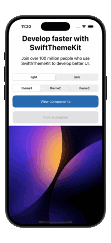
]Click to view full-size previews from snapshot tests:
- Prefer
.applyTheme*Style()over custom modifiers - Use semantic tokens (e.g.,
themeColor.primary) instead of raw colors - Override per-view styles using
View.theme*()modifiers - Preview multiple themes using SwiftUI
ForEach
- iOS 14+, macOS 11+, tvOS 15+, watchOS 7+
- Swift 5.5+
We welcome issues and PRs!
Check the CONTRIBUTING.md for setup and guidelines.
MIT. See LICENSE for details.
swift, swiftui, design-system, ui-kit, dark-mode, theme, component-library, design-token, sdk