Long axis labels get truncated, left and right #279
Description
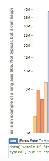
Using the "try it out online" site, I entered the following syntax:
data('sample:US States.csv') bar x(abbr) y(population) color(dem_rep:reds-blues) axes(y:'This is an example of a long axis title. Not typical, but it can happen')
Look at the Y-axis label. It is truncated both at the start and at the end. I would like to have a better way of handling longer titles.