[Snyk] Upgrade react-toastify from 8.0.0 to 8.2.0 #5
Conversation
This file contains hidden or bidirectional Unicode text that may be interpreted or compiled differently than what appears below. To review, open the file in an editor that reveals hidden Unicode characters.
Learn more about bidirectional Unicode characters
Snyk has created this PR to upgrade react-toastify from 8.0.0 to 8.2.0.

See this package in npm:
react-toastify

See this project in Snyk:
https://app.snyk.io/org/ankan-cyber/project/54f8b6d7-9c8e-484f-98b0-e76cc3e9eae7?utm_source=github&utm_medium=referral&page=upgrade-pr
Sign up for free
to join this conversation on GitHub.
Already have an account?
Sign in to comment
2 participants
Add this suggestion to a batch that can be applied as a single commit.
This suggestion is invalid because no changes were made to the code.
Suggestions cannot be applied while the pull request is closed.
Suggestions cannot be applied while viewing a subset of changes.
Only one suggestion per line can be applied in a batch.
Add this suggestion to a batch that can be applied as a single commit.
Applying suggestions on deleted lines is not supported.
You must change the existing code in this line in order to create a valid suggestion.
Outdated suggestions cannot be applied.
This suggestion has been applied or marked resolved.
Suggestions cannot be applied from pending reviews.
Suggestions cannot be applied on multi-line comments.
Suggestions cannot be applied while the pull request is queued to merge.
Suggestion cannot be applied right now. Please check back later.
Snyk has created this PR to upgrade react-toastify from 8.0.0 to 8.2.0.
ℹ️ Keep your dependencies up-to-date. This makes it easier to fix existing vulnerabilities and to more quickly identify and fix newly disclosed vulnerabilities when they affect your project.
The recommended version is 7 versions ahead of your current version.
The recommended version was released 4 years ago.
Release notes
Package name: react-toastify
-
8.2.0 - 2022-02-14
- add deprecation notice for
- add deprecation notice for
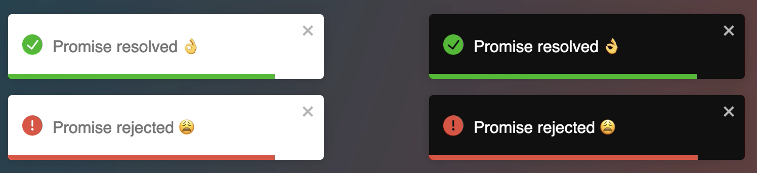
- fix #707 Promise toast does not close automatically if promise resolves too quickly
- bump parcel to latest version
-
8.1.1 - 2022-02-01
- fix #702 autoClose duration start after the entrance animation finish
- fix #689 prevents promise without success to hang on to the pending state
- fix #645 and #618
- fix #694 Fix error in Chrome: remove preventDefault from passive listener
- #703 the
- exit animation on safari are not conflicting with drag transition anymore
-
8.1.0 - 2021-11-03
- add support for optional stages in promise #646
-
8.0.3 - 2021-09-24
- fix text-align has not effect on content #657
- fix disabling icon individually #658
- fix tree shaking #641
-
8.0.2 - 2021-08-30
- fix #635 Icon on safari not displayed
-
8.0.2-with-side-effects - 2021-08-31
-
8.0.1 - 2021-08-27
-
8.0.0 - 2021-08-26


//Set the theme globally
- The separation between theme and type. The type
// before v8
- Notifications of different types are not colored by default, but they look pretty by default now 😆. You can use the
- An icon is displayed by default for the notificaiton of type
// to opt-out gloablly from this behavior
- the following css classes has been removed
- update all dependencies
from react-toastify GitHub release notesRelease note
toast.configure.toast.onChange. API for this method will change in the next major release🕷 Bugfixes
⚙️ Chore
Release notes
🕷 Bug fixes
onClosenow work as expected!⚙️ Chore
ToastPromiseParamsis now exportedThanks to @ 03c, @ wilson-webdev, @ essential-randomness for their contributions
Release notes
🚀 Features
Release notes
🐞 Bugfixes
Release Notes
Bugfix
Release notes
Features
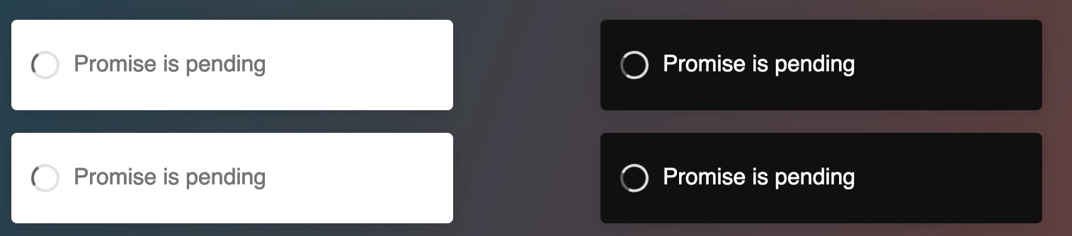
toast.promiseaccept function that returns a promise.React-toastify has been around for 5 years(will turn five the 8 November 🎂). Since the beginning, one of the goals was to provide a library that is highly customizable and also able to work out of the box. Every major release introduces breaking changes but this is for the best 👌.
🚀 Features
New look
Notifications of different types (
toast.info,toast.error,toast.success,toast.warning) display an icon associated with the selected type. You can also notice that the progress bar color matches the type color.Don't be afraid 😱, if you don't like those icons you can use your own or remove them. This is what it looks like in practice.
Clear separation between type and theme
Prior to v8,
toast.info,toast.error, etc... Would display respectively a blue notification, a red notification, etc... This is not the case anymore. There are 3 distinct themes:light,dark,colored. The theme can be applied globally or per notification.<ToastContainer theme="dark" />
// define per toast
toast.info("Display a dark notification of type info");
toast.info("Display a light notification of type info", { theme: "light" });
toast.info("Display a blue notification of type info", { theme: "colored" });
This separation will benefit theming in the future.
I promise this is new, I'll tell you if you await
The library exposes a
toast.promisefunction. Supply a promise and the notification will be updated if it resolves or fails. When the promise is pending a spinner is displayed. Again you hide it, I bet you already know how to😆.Let's start with a simple example
Displaying a simple message is what you would want to do in 90% of cases. But what if the message you want to display depends on the promise response, what if you want to change some options for the error notification? Rest assured, under the hood, the library uses
toast.update. Thanks to this, you have full control over each notification.If you want to take care of each step yourself you can use
toast.loadingand update the notification yourself.Pass data even when you are not rendering a react component
One way to pass data to the notification was to use the context api or provide your own component. Starting v8 a
dataoption is now available to make it easier.I just want to change few colors
Most of the time, users are ok with the default style, they just want to change some colors to match their brand. I think one way to improve the DX for all of us is to embrace CSS variables. That's why the library has switched to css variables!
All you want is to change the color of the progress bar? No problem
You can find the list of all exposed variables here
💥 Breaking changes
There are few breaking changes.
darkhas been removedtoast("hello", {
type: "dark"
})
// toast.TYPE.DARK is no longer available
// in v8
toast("hello", {
theme: "dark"
})
// or
toast.dark("hello")
coloredtheme to get the same behavior as the previous versioninfo,error,warning,success<ToastContainer icon={false} />
// or per toast
toast.info("hello", {
icon: false
});
⚙️ Chore
That's it for this release. Thank you for using react-toastify and happy coding!
Important
Note: You are seeing this because you or someone else with access to this repository has authorized Snyk to open upgrade PRs.
For more information: