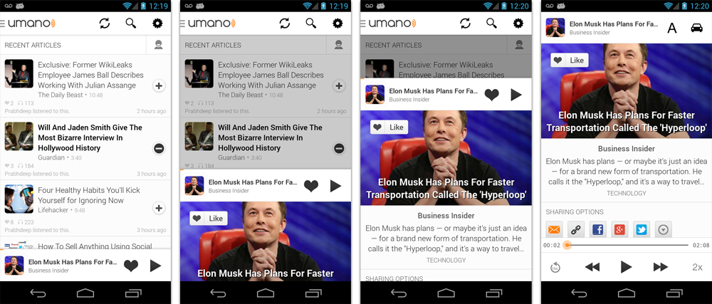
This library provides a simple way to add a draggable sliding up panel (popularized by Google Music, Google Maps and Rdio) to your Android application. Umano Team <3 Open Source.
As seen in Umano Android app:
Download the latest release and include the library project as a dependency in Eclipse.
Simply add the following dependency to your build.gradle file to use the latest version:
dependencies {
    repositories {
        mavenCentral()
    }
    compile 'com.sothree.slidinguppanel:library:3.0.0'
}- Include
com.sothree.slidinguppanel.SlidingUpPanelLayoutas the root element in your activity layout. - The layout must have
gravityset to eithertoporbottom. - Make sure that it has two children. The first child is your main layout. The second child is your layout for the sliding up panel.
- The main layout should have the width and the height set to
match_parent. - The sliding layout should have the width set to
match_parentand the height set to eithermatch_parent,wrap_contentor the max desireable height. - By default, the whole panel will act as a drag region and will intercept clicks and drag events. You can restrict the drag area to a specific view by using the
setDragViewmethod orumanoDragViewattribute.
For more information, please refer to the sample code.
<com.sothree.slidinguppanel.SlidingUpPanelLayout
    xmlns:sothree="http://schemas.android.com/apk/res-auto"
    android:id="@+id/sliding_layout"
    android:layout_width="match_parent"
    android:layout_height="match_parent"
    android:gravity="bottom"
    sothree:umanoPanelHeight="68dp"
    sothree:umanoShadowHeight="4dp">

    <TextView
        android:layout_width="match_parent"
        android:layout_height="match_parent"
        android:gravity="center"
        android:text="Main Content"
        android:textSize="16sp" />

    <TextView
        android:layout_width="match_parent"
        android:layout_height="match_parent"
        android:gravity="center|top"
        android:text="The Awesome Sliding Up Panel"
        android:textSize="16sp" />
</com.sothree.slidinguppanel.SlidingUpPanelLayout>
For smooth interaction with the ActionBar, make sure that windowActionBarOverlay is set to true in your styles:
<style name="AppTheme">
    <item name="android:windowActionBarOverlay">true</item>
</style>
However, in this case you would likely want to add a top margin to your main layout of ?android:attr/actionBarSize
or ?attr/actionBarSize to support older API versions.
- If you are using a custom
umanoDragView, the panel will pass through the click events to the main layout. Make your second layoutclickableto prevent this. - You can change the panel height by using the
setPanelHeightmethod orumanoPanelHeightattribute. - If you would like to hide the shadow above the sliding panel, set
shadowHeightattribute to 0. - Use
setEnabled(false)to completely disable the sliding panel (including touch and programmatic sliding) - Use
setTouchEnabled(false)to disables panel's touch responsiveness (drag and click), you can still control the panel programatically - Use
getPanelStateto get the current panel state - Use
setPanelStateto set the current panel state - You can add paralax to the main view by setting
umanoParalaxOffsetattribute (see demo for the example). - You can set a anchor point in the middle of the screen using
setAnchorPointto allow an intermediate expanded state for the panel (similar to Google Maps). - You can set a
PanelSlideListenerto monitor events about sliding panes. - You can also make the panel slide from the top by changing the
layout_gravityattribute of the layout totop. - By default, the panel pushes up the main content. You can make it overlay the main content by using
setOverlayedmethod orumanoOverlayattribute. This is useful if you would like to make the sliding layout semi-transparent. You can also setumanoClipPanelto false to make the panel transparent in non-overlay mode. - By default, the main content is dimmed as the panel slides up. You can change the dim color by changing
umanoFadeColor. Set it to"@android:color/transparent"to remove dimming completely.
This library was initially based on the opened-sourced SlidingPaneLayout component from the r13 of the Android Support Library. Thanks Android team!
Tested on Android 2.2+
- Jan 21, 14 - ChaYoung You (@yous) - Slide from the top support
- Aug 20, 13 - (@gipi) - Android Studio Support
- Jul 24, 13 - Philip Schiffer (@hameno) - Maven Support
- Oct 20, 13 - Irina Preșa (@iriina) - Anchor Support
- Dec 1, 13 - (@youchy) - XML Attributes Support
- Dec 22, 13 - Vladimir Mironov (@mironov-nsk) - Custom Expanded Panel Height
If you have an awesome pull request, send it over!
- 3.0.0
- Added
umanoprefix for all attributes - Added
clipPanelattribute for supporting transparent panels in non-overlay mode. setEnabled(false)- now completely disables the sliding panel (touch and programmatic sliding)setTouchEnabled(false)- disables panel's touch responsiveness (drag and click), you can still control the panel programaticallygetPanelState- is now the only method to get the current panel statesetPanelState- is now the only method to modify the panel state from code
- Added
- 2.0.2 - Allow
wrap_contentfor sliding view height attribute. Bug fixes. - 2.0.1 - Bug fixes.
- 2.0.0 - Cleaned up various public method calls. Added animated
showPanel/hidePanelmethods. - 1.0.1 - Initial Release
Licensed under the Apache License, Version 2.0 (the "License"); you may not use this work except in compliance with the License. You may obtain a copy of the License in the LICENSE file, or at:
http://www.apache.org/licenses/LICENSE-2.0
Unless required by applicable law or agreed to in writing, software distributed under the License is distributed on an "AS IS" BASIS, WITHOUT WARRANTIES OR CONDITIONS OF ANY KIND, either express or implied. See the License for the specific language governing permissions and limitations under the License.
