Bike sharing systems are new generation of traditional bike rentals where whole process from membership, rental and return back has become automatic. Through these systems, user is able to easily rent a bike from a particular position and return back at another position. Currently, there are about over 500 bike-sharing programs around the world which is composed of over 500 thousands bicycles. Today, there exists great interest in these systems due to their important role in traffic, environmental and health issues.
Apart from interesting real world applications of bike sharing systems, the characteristics of data being generated by these systems make them attractive for the research. Opposed to other transport services such as bus or subway, the duration of travel, departure and arrival position is explicitly recorded in these systems. This feature turns bike sharing system into a virtual sensor network that can be used for sensing mobility in the city. Hence, it is expected that most of important events in the city could be detected via monitoring these data.
https://archive.ics.uci.edu/ml/datasets/Bike+Sharing+Dataset
From this project I want to learn how to work with big data and to prove a specific point using an appropriate statical methods, to achieve this aims I will go deeper in python’s library pandas and matplot.
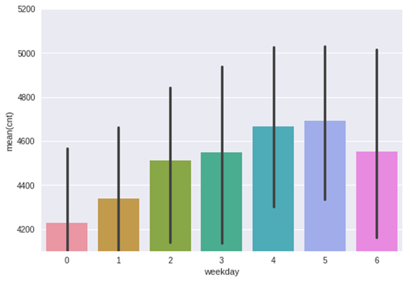
1- Do people rent bikes in weekend more than the beginning of the week ?
2- Do people rent bikes in working days more than normal days ?
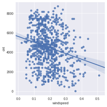
3- Does wind speed affect renting bikes ?
4- Does weather condition affect renting bikes ?
5- Is there is a relation between weather situation and humidity ?
" You can find more details in the main notebook "
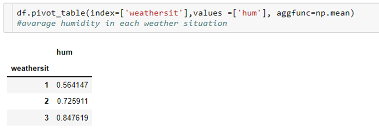
By ranking the weather situations as follow
1- Clear, Few clouds, Partly cloudy, Partly cloudy
2- Mist + Cloudy, Mist + Broken clouds, Mist + Few clouds, Mist
3- Light Snow, Light Rain + Thunderstorm + Scattered clouds, Light Rain + Scattered clouds
And Using the aggregation function “mean” we can see that humidity increases with weather situation. the cloudier the weather is the more humidity there are
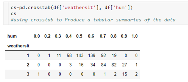
By using python’s crosstab we can see an interesting summaries of the weather situation and humidity over the whole dataset Note that the hum columns have been rounded to get this 10 columns crosstab
Average number of rented bikes in each day, visualized using bar plot
By scatter plotting windspeed and number of rented bikes We can see that there is a lot of dots centered in a specific spot
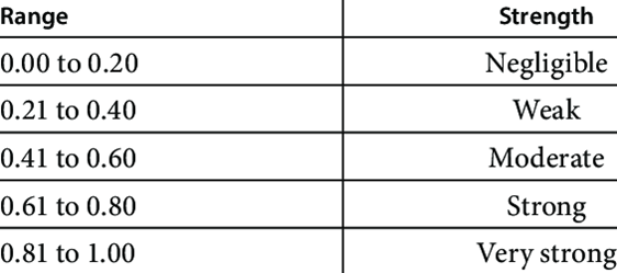
By using seaborn’s heat map to visualize the correlation between every two variables using spearman method


-Frost, J., 2020. Spearman’s Correlation Explained. [Online]
Available at: https://statisticsbyjim.com/
Accessed 5 October 2022.
-Kumar, P., 2021. SciPy in Python. [Online]
Available at: https://www.h2kinfosys.com/
Accessed 6 October 2022.
-pands, 2020. Pandas Library. [Online]
Available at: https://pandas.pydata.org/
Accessed 5 October 2020.
-Simplilearn, 2022. What is Statistical Analysis?. [Online]
Available at: https://www.simplilearn.com/
Accessed 8 October 2022.
-Solomon, B., 2020. Python Plotting With Matplotlib. [Online]
Available at: https://realpython.com/
Accessed 4 October 2022.