postgrest-ui is a library of Reagent components for interfacing with databases using PostGREST.
The focus of this library is to create reusable and customizable components for common UI tasks, like listing views and forms, and provide a wrapper for the HTTP interface via Fetch.
The goal is to keep the components general purpose and allow them to be integrated into any
frontend framework. The components can keep their own state, or use customer provided state
(with :state and :set-state! keys in options).
- Set up PostgreSQL
- Create dvdrental sample database
- Run PostgREST
- Start figwheel:
clj -m figwheel.main -b dev -r
The rendering is done indirectly via multimethods. Style can be set as default or passing
the :style option to components.
postgrest-ui comes with 2 rendering styles:
:default:material
The :default mode outputs regular HTML elements and is customized in CSS (see resources/public/postgrest-ui.css).
The :material mode outputs Material UI components and requires the page include the library.
Listing component can be used to generate basic listings views. They support selecting a row and adding a drawer component.
Listing automatically includes batching and will load more items when scrolling down.
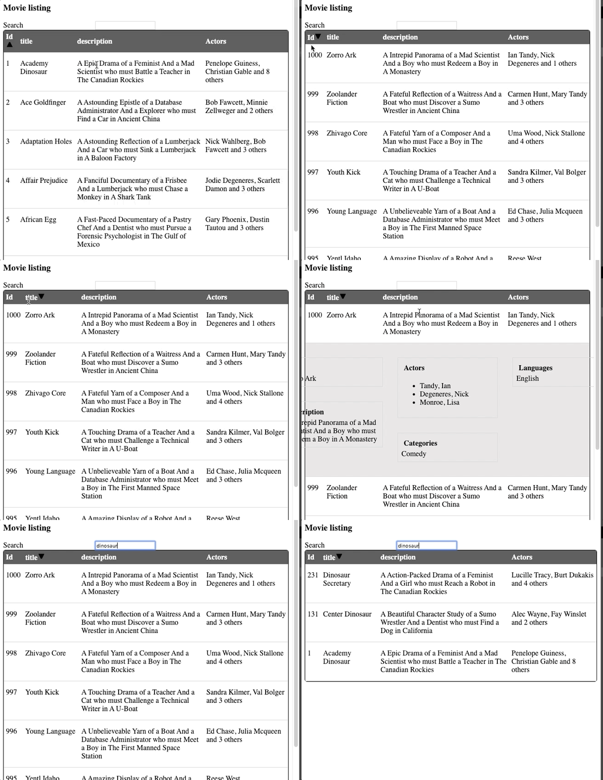
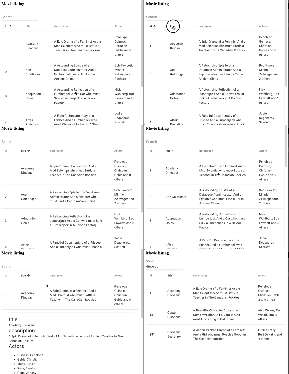
Below shows an example of listing with simple filters view and drawer with an item view.
Listing using default rendering style:

|
Listing using Material UI rendering style:

|
Example code:
;; see example.cljs for full example code
(defn listing-view []
  [:div
   [:h3 "Movie listing"]
    [listing/filtered-listing
     {:endpoint endpoint
      :table "film"
      :filters-view (r/partial filters/simple-search-form ["title" "description"])
      :select ["film_id" "title" "description"
               {:table "actor"
                :select ["first_name" "last_name"]}]
      :drawer (fn [item]
                [item-view/item-view
                 {:endpoint endpoint
                  :table "film"
                  :select ["title" "description"
                           {:table "actor"
                            :select ["first_name" "last_name"]}
                           {:table "category"
                            :select ["name"]}
                           {:table "language"
                            :select ["name"]}]}
                 (get item "film_id")])
      :column-widths ["5%" "20%" "45%" "30%"]
      :order-by [["film_id" :asc]]
      :label str
      :batch-size 20}]])
Form component will create an editable input form for a table. The form uses schema information to create suitable inputs based on the column types.
It can also do selection based on foreign key links.
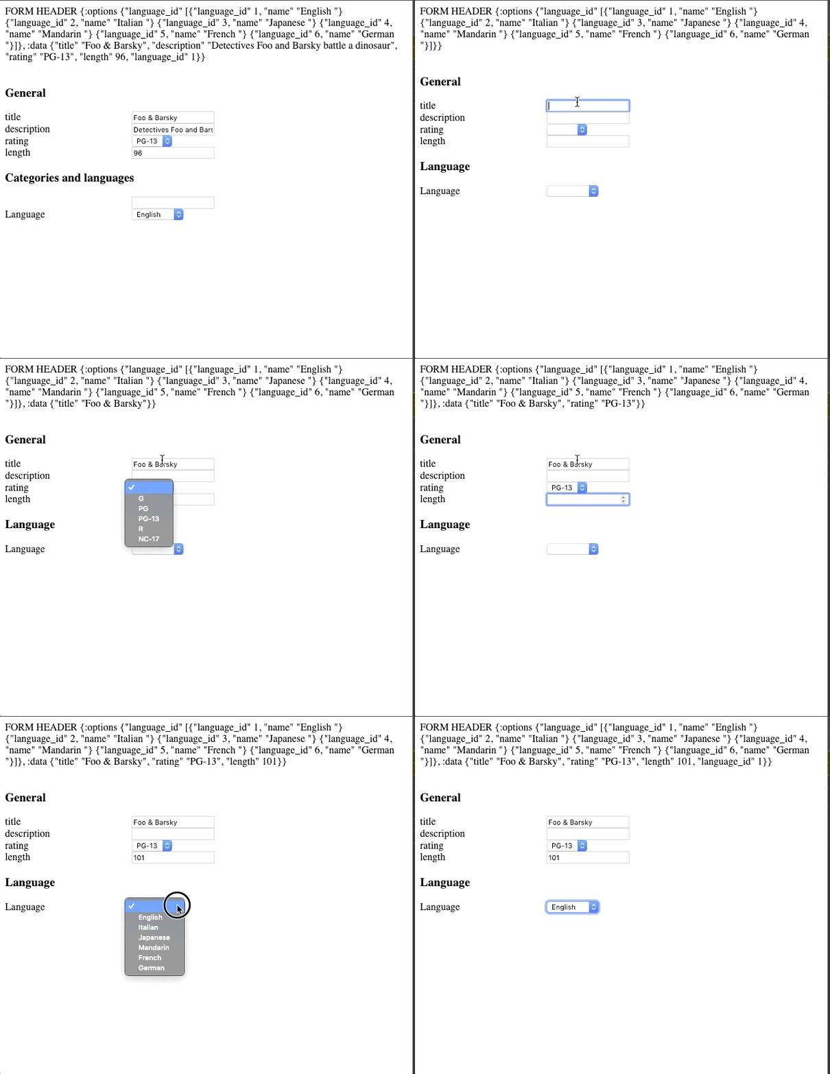
Form using default rendering style:

|
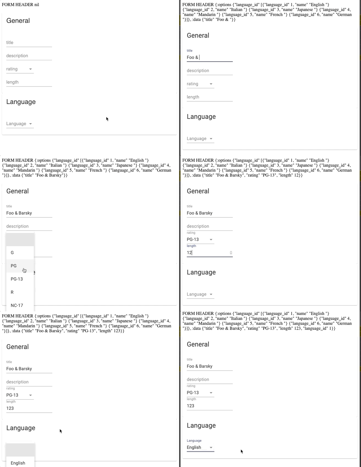
Form using Material UI rendering style:

|
Example code:
(defn form-header [form-data]
  [:<>
   [:div "FORM HEADER " (pr-str form-data)]
   [:br]])

(defmethod display/label ["film" "language_id"] [_ _] "Language")

(defn form-view []
  [form/form
   {:endpoint endpoint
    :table "film"
    :layout [{:group :general :label "General" :columns ["title" "description" "rating" "length"]}
             {:group :info :label "Language"
              :columns [;; Foreign key reference, show selection from the rows with
                        ;; :option-label column as the label
                        {:column "language_id"
                         :option-label "name"}]}]
    :header-fn form-header}])