This page contains all detailed info and tips about the shapes feature of PowerfulImageView.
Most applications need some kind of shape. Since the library wants to show a progress indicator over the image, it makes sense to support many shapes natively to provide indicator over the shapes.
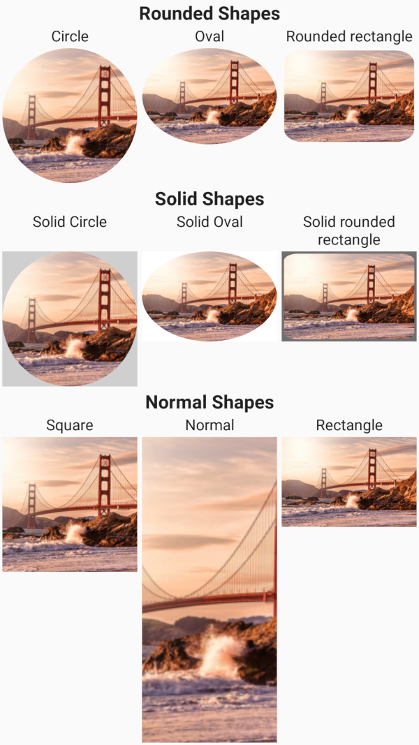
Shapes are divided into 3 types:
- Rectangular (normal, square, rectangle): These shapes should be as efficient as normal ImageViews. Only dimensions are affected;
- Rounded (circle, oval, rounded rectangle): These shapes are achieved following techniques recommended by Romain Guy. Transformation and animations applied by image loaders like Glide or Picasso may cause issues. To avoid issues, you should disable any animation. For Picasso use the
noFade()option, for Glide usedontAnimate(). - Solid (solid_circle, solid_oval, solid_rounded_rectangle): These shapes consist in a solid color drawn over them. They are very efficient and support out of the box any animation and image loader library. They completely cover the background, too, in contrast with non-solid shapes, which allow users to see anything behind them.
All shapes are compatible with any kind of drawable, and they provide support for shaping background and foreground drawables, too, except for rounded shapes.
Background and foreground drawables will be resized to be equal to the current drawable, and follow scale type, too. As a consequence, they will be drawn only if there is a drawable set.
All scale types are supported, and some additional scale type were added, like topCrop and bottomCrop.
Vector drawables are supported, too, and they are scaled up to max resolution before applying the shape.
Due to how rounded rectangles are drawn, they will show some space between the image and the border (if pivShapeBorderOverlay=false).
Also, solid rounded rectangle suffers of the same problem when using a border (with or without overlay).
Performance
To create rounded shapes, BitmapShader is used. In all other cases, the drawable will be drawn directly as in a normal ImageView.
Reliability
Methods to avoid and catch OutOfMemoryExceptions are in place.
Customizability
All aspects can be customized. From the image inner padding to background and foreground drawables and color to the border size and color.
Ease of use
Basic integration needs only pivShapeMode to the xml element.
| Name | Type | Default | Description |
|---|---|---|---|
| pivShapeMode | enum | normal | Progress mode of the indicator. Values are: normal, circle, square, rectangle, oval, rounded_rectangle, solid_circle, solid_oval, solid_rounded_rectangle. |
| pivShapeScaleType | enum | default view scale type | Custom scale type of the indicator. It overrides scaleType. Values are: matrix, fitXY, fitStart, fitCenter, fitEnd, center, centerCrop, centerInside, topCrop, bottomCrop |
| pivShapeInnerPadding | dimension-fraction | 0 | Set the inner padding of the image relative to the view, in a specific dimension or in percentage (20dp or 30%). If the specific dimension is less than 0, it is ignored. If the percentage is higher than 100, it is treated as (value % 100). |
| pivShapeBorderWidth | dimension | 0dp | Set the border width of the image. |
| pivShapeRatio | float | based on view size | Set the ratio of the image. Doing so, width is calculated as height * ratio |
| pivShapeRadiusX | float | 1 | Set the x radius of the image. Used in rounded rectangles |
| pivShapeRadiusY | float | 1 | Set the y radius of the image. Used in rounded rectangles |
| pivShapeBorderOverlay | boolean | false | Set whether the border should be paint over the image. |
| pivShapeSolidColor | color | #FFFFFF | Set the solid color used by solid shapes |
| pivShapeBackgroundColor | color | transparent | Set the background color of the image, using the shape. |
| pivShapeForegroundColor | color | transparent | Set the foreground color of the image, using the shape. |
| pivShapeBackground | reference-color | null | Set the background drawable to draw under the image. Does not follow rounded shapes! |
| pivShapeForeground | reference-color | null | Set the foreground drawable to draw over the image. Does not follow rounded shapes! |
| pivShapeBorderColor | color | transparent | Set the border color of the image. |
Java methods
All options are available via progressImageView.getShapeOptions().set...
Convenience methods are provided for:
| Name | Param | Description |
|---|---|---|
| setShapeMode | PivShapeMode | Changes the shape of the image. |
| setScaleType | PivShapeScaleType | Controls how the image should be resized or moved to match the size of this ImageView. Added to provide additional custom scale types. Overrides ImageView's setScaleType(ImageView.ScaleType) method. |
| getShapeMode | Get the current shape mode selected. It can then be used to check whether the shape is rectangular, rounded or solid through its methods. |