Dropdown #57
Dropdown #57
Conversation
|
Just collecting a couple of thoughts that I dumped in Slack about this here... First off, I suggested that we call this component MergeButton, since Dropdown is a way more generalized form of "button that opens an absolutely positioned menu". Structurally, in my mind MergeButton renders a button group with a primary button ("Merge pull request") and a dropdown that updates the merge button text and/or a hidden form input. Something like the following HTML: <div class='BtnGroup'>
<button class='btn btn-primary BtnGroup-item'>Merge pull request</button>
<details class='details-reset BtnGroup-form'>
<summary class='btn btn-primary BtnGroup-item position-relative'>
(up/down arrow)
</summary>
<div class='Box position-absolute' style='top: 100%'>
(dropdown content)
</div>
</details>
</div>or even a component that looks something like this, making a bunch of assumptions: class MergeBox extends React.Component {
setSelectedMode(mode) {
const {onSelect} = this.props
if (typeof onSelect === 'function') {
onSelect(mode)
}
this.setState({selectedMode: mode})
}
render() {
const {mergeModes} = this.props
const {selectedMode} = this.state
return (
<ButtonGroup>
<ButtonPrimary>{selectedMode.buttonText}</ButtonPrimary>
<Details position='relative'>
{({open, toggle}) => <React.Fragment>
<ButtonPrimary tag='summary' onClick={toggle}>{open ? '▲' : '▼'}</ButtonPrimary>
<Box shadow position='absolute' top='100%'>
{mergeModes.map(mode => (
<Button block linkStyle
active={mode === selectedMode}
onClick={e => this.setSelectedMode(mode)}>
{mode.title}
</Button>
))}
</Box>
</React.Fragment>}
</Details>
</ButtonGroup>
)
}
}As far as how ButtonGroup might work, one way we could do it is to have the ButtonGroup component be responsible for adding all of the requisite
|
src/Button.js
Outdated
| if (grouped) className.push('BtnGroup-item') | ||
| if (size === "small") className.push('btn-sm') | ||
| if (size === "large") className.push('btn-large') | ||
| if (block) className.push('block') |
There was a problem hiding this comment.
not feeling amazing about this section... lots of props 😂
There was a problem hiding this comment.
How about trying out classifier()?
const mapButtonProps = classifier({
  block: 'block',
  scheme: value => `btn-${scheme}`,
  size: value => `btn-${size}`,
  grouped: 'BtnGroup-item',
})
Because btn and btn-link are mutually exclusive, you might need to handle that switch like so:
const classifyButtonProps = /* as above */

const mapButtonProps = ({linkStyle, ...rest}) => {
  const props = {className: linkStyle ? 'btn-link' : 'btn', ...rest}
  return classifyButtonProps(props)
}
Then, you can make a "castable" Button component with:
const Button = chameleon('button', mapButtonProps)✨
There was a problem hiding this comment.
And then you could have the prop types validated with something like:
Button.propTypes = {
  block: PropTypes.bool,
  grouped: PropTypes.bool,
  scheme: PropTypes.string,
  size: PropTypes.oneOf(['small', 'large'])
}There was a problem hiding this comment.
How would we go about sending in a variable for the tag in this case?
This reverts commit 9314948.
| disabled, | ||
| ...props | ||
| }) { | ||
| const classes = classnames( |
There was a problem hiding this comment.
@shawnbot I ended up using classnames here instead of the classifier method because I was having trouble getting it to work while also transforming the Tag prop 🤔 I went back and forth a bunch, but I also feel like this method is a bit more straightforward to read so going to go forward with it!
There was a problem hiding this comment.
No worries! Let's nix the import map, { classifier } from './props' above then.
src/Details.js
Outdated
| return typeof children === 'function' ? children : () => children | ||
| } | ||
|
|
||
| export default class Details extends React.PureComponent { |
There was a problem hiding this comment.
I don't know what I was thinking here, but in retrospect I don't think this is a "pure" component. 😬 Can we switch this to extends React.Component?
src/Details.js
Outdated
|
|
||
| return ( | ||
| <details open={open} className='details-reset'> | ||
| <details {...props} className={className || 'details-reset'} open={open}> |
There was a problem hiding this comment.
I think we always want details-reset here so that folks overriding className don't have to pass it. Could we do this instead?
className={classnames('details-reset', className)}
| 'BtnGroup-item': grouped, | ||
| }, | ||
| scheme ? `btn-${scheme}` : null | ||
| ); |
There was a problem hiding this comment.
have we decided not to use semicolons as a team?
There was a problem hiding this comment.
Yeah, it's pretty much the house style at GitHub; see the prettier config in eslint-plugin-github. I tried to get us linting with that in #28, but quoted JSX attributes were a problem.
There was a problem hiding this comment.
Oh dang! I'd love to work on that a bit more to see if we can get linting set up sometime this week! :D I'll take a look!
|
One thing I noticed is that the dropdown content doesn't have a z-index:
I tried hacking it with This feels like a blocker, though. |
|
@shawnbot Hmm my thought was that styling of the content of the dropdown would be entirely up to whichever component you pass in as the content... but I suppose it can't hurt to add an extra safety z-index in the Dropdown component |
|
@shawnbot done! added a white background and zindex of 9999 :) |
 shawnbot
left a comment
shawnbot
left a comment
shawnbot
left a comment
There was a problem hiding this comment.
This rad, let's ship it!
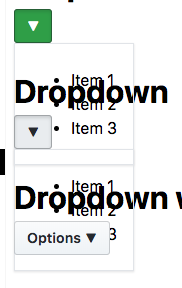
Creates a generic Dropdown component which corresponds to https://styleguide.github.com/primer/components/dropdown/
Refactors Button & Details to accommodate for the case where we might like a Details element to appear like our Buttons. This allows us to build the MergeBox component 🎉
Most of the refactoring of Button & Details was copypasta from @shawnbot 's help this morning in Slack! TY! 🙏
Users could just use Button and Details to create this, but since there are a few tricks to make it work correctly, and we probably don't want to encourage people to make free use of the
isprop, I decided to make this a separate component.Open questions to discuss during our Component API review:
Do we want to remove the variations of button that we currently have and use the
schemeprop instead, like we are doing here? I know that Diana mentioned before wanting these to be separate incase we'd like to add special functionality/restrictions to each oneI'm a bit worried about the
isprop being public although it's the only way to make this component work. An alternative would be to create a separate SummaryButton component to be used with Details.I had to add d-flex to Details classNames prop in order to get the positioning correct, which reminded me that we might not want to expose classNames to consumers of details? Curious what @shawnbot thinks
To Do:
Make the arrow prettierAdd caret to top of dropdown content