-
-
Notifications
You must be signed in to change notification settings - Fork 2.3k
New issue
Have a question about this project? Sign up for a free GitHub account to open an issue and contact its maintainers and the community.
By clicking “Sign up for GitHub”, you agree to our terms of service and privacy statement. We’ll occasionally send you account related emails.
Already on GitHub? Sign in to your account
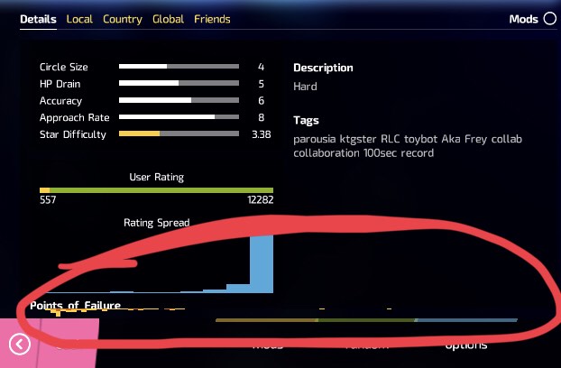
Points of Failure on the Details tab is hard to see when UI Scaling is set above 1. #4931
Comments
|
I have noticed this, where the graph actually inverts. The solution is likely going to involve some reorganising of |
|
This is more of a UX/UI comment rather than on the actual implementation of this - but in my opinion the entire details tab is redundant & the information is better held elsewhere (Failure rate is generally useless for most players & can instead be shown just on the webiste), the Difficulty specific info should be elsewhere to allow the viewing of the Leaderboards at the same time as the difficulty specific setup info (AR/CS...) |
|
This does not happen on |
|
Tested and it does still happen. |

Points of Failure can’t be seen properly in the details tab when UI Scale is set above 1.

Image:
Specific device: iPhone 7
This might happen on PC as well.
The text was updated successfully, but these errors were encountered: