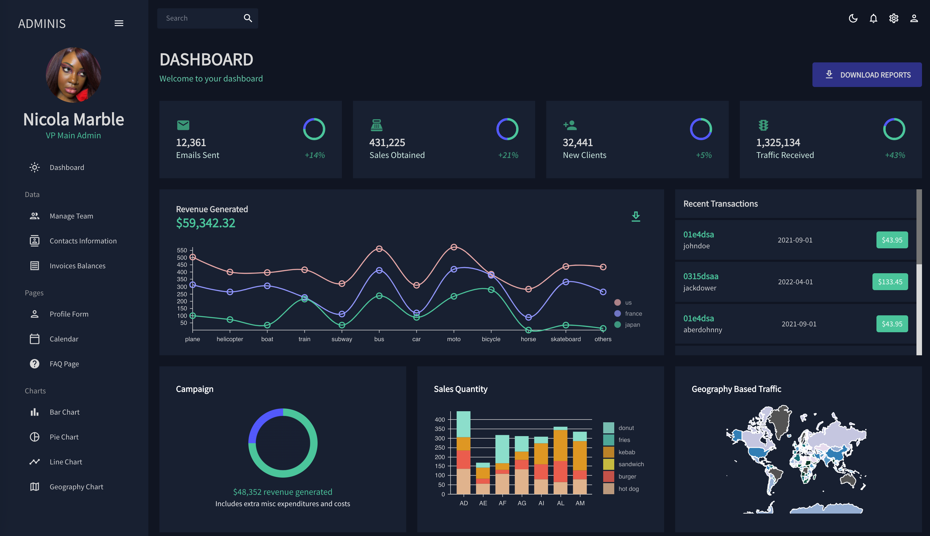
A front end demonstration of a dashboard for administrators. Managing data is an important part of any business practice. That data, however, can become difficult to understand without adequate visualizations. This application provides an interactive user experience to view and manipulate that data at first glance. This application even has a light and dark mode, to keep up with current industry trends. This application is best suited for desktop, but does provide a collapsable side-bar to allow more space to view the data.
Because there were so many reused components through the different pages of this application, the React framework was used to render said compoonent across multiple pages.
Material UI was used to design the visual aesthetic of the application. Material UI offers pre-built components that provide industry standard displays while also allowing these components to be uniquely altered to fit our own particular needs. To implement our own customized theme, we created a context using React that contained color tokens that we wanted to use within the app. Then we passed these into createTheme function provided by MUI.
// context for color mode
export const ColorModeContext = createContext({
  toggleColorMode: () => {},
});

export const useMode = () => {
  const [mode, setMode] = useState("dark");

  const colorMode = useMemo(
    () => ({
      toggleColorMode: () =>
        setMode((prev) => (prev === "light" ? "dark" : "light")),
    }),
    []
  );

  const theme = useMemo(() => createTheme(themeSettings(mode)), [mode]);
  return [theme, colorMode];
};
Here, we create a context to trigger a toggle between the light and dark options. We create another function that utilizes the useMemo() method provided by React to load the context on page load. We pass this configuration down at the top-level of our components to render the theme. We can see an example, of this in play in the dashboard component. In the code below, we make a call to our theme and the color tokens we defined. This allows us to change the colors of our components within the component props and the system props that MUI provides with the sx property.
const Dashboard = () => {
  const theme = useTheme();
  const colors = tokens(theme.palette.mode);

  return (
    <Box m="20px">
      {/* HEADER */}
      <Box display="flex" justifyContent="space-between" alignItems="center">
        <Header title="DASHBOARD" subtitle="Welcome to your dashboard" />

        <Box>
          <Button
            sx={{
              backgroundColor: colors.blueAccent[700],
              color: colors.grey[100],
              fontSize: "14px",
              fontWeight: "bold",
              padding: "10px 20px",
            }}
          >
            <DownloadOutlinedIcon sx={{ mr: "10px" }} />
            Download Reports
          </Button>
        </Box>
      </Box>
      ...
)To display our interactive charts we used the Nivo library. Nivo's website allows us to configure our data visualization and generates a boilerplate codee for us to use. The website also supplies us with sample data that is needed to satisfy what the visualizations need. This pre-determined data was used to create the visualizations within our app where it would usually be served from the backend.