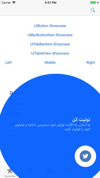
An elegant and beautiful tap showcase view for iOS apps based on Material Design Guidelines.
 |
 |
|---|---|
 |
 |
 |
- iOS 8.0+
- Swift 3.0+
You can install it by using CocoaPods. Please add the following line to your Podfile.
pod 'MaterialShowcase'
  let showcase = MaterialShowcase()
  showcase.setTargetView(view: button) // always required to set targetView
  showcase.primaryText = "Action 1"
  showcase.secondaryText = "Click here to go into details"
  showcase.show(completion: {
    _ in
    // You can save showcase state here
    // Later you can check and do not show it again
})Note: showcase.show() should be called after your views are placed correctly, for example inside UIViewController's viewWillAppear() or viewDidAppear() function. You SHOULD NOT call it inside viewDidLoad() because views have not laid down correctly yet, showcase can not calculate these views positions and it results in unexpected errors.
There are several target view supported.
  // Any UIView
  showcase.setTargetView(view: view)
  // UIBarButtonItem
  showcase.setTargetView(barButtonItem: barItem)
  // UITabBar item
  showcase.setTargetView(tabBar: tabBar, itemIndex: 0)
  // UItableViewCell
showcase.setTargetView(tableView: tableView, section: 0, row: 0) // Right after showing.
showcase.show(completion: {
_ in
// You can save showcase state here
})
// To handle other behaviors when showcase is dismissing, delegate should be declared.
showcase.delegate = self
extension ViewController: MaterialShowcaseDelegate {
func showCaseWillDismiss(showcase: MaterialShowcase) {
print("Showcase \(showcase.primaryText) will dismiss.")
}
func showCaseDidDismiss(showcase: MaterialShowcase) {
print("Showcase \(showcase.primaryText) dimissed.")
}
}In default, text aligment is set to be left-to-right. If you want to show text in right-to-left direction. Please define following.
showcase.primaryTextAlignment = .right
showcase.secondaryTextAlignment = .rightIn default, showcase will be dismissed when users click to any place in whole showcase view. If you want to dismiss showcase only when users click to target view correctly, please set the following property.
showcase.isTapRecognizerForTagretView = trueYou can define your own styles based on your app.
  // Background
  showcase.backgroundPromptColor = UIColor.blue
  showcase.backgroundPromptColorAlpha = 0.96
  // Target
  showcase.targetTintColor = UIColor.blue
  showcase.targetHolderRadius = 44
  showcase.targetHolderColor = UIColor.white
  // Text
  showcase.primaryTextColor = UIColor.white
  showcase.secondaryTextColor = UIColor.white
  showcase.primaryTextSize = 20
  showcase.secondaryTextSize = 15
  showcase.primaryTextFont = UIFont.boldSystemFont(ofSize: primaryTextSize)
  showcase.secondaryTextFont = UIFont.systemFont(ofSize: secondaryTextSize)
  //Alignment
  showcase.primaryTextAlignment = .left
  showcase.secondaryTextAlignment = .left
  // Animation
  showcase.aniComeInDuration = 0.5 // unit: second
  showcase.aniGoOutDuration = 0.5 // unit: second
  showcase.aniRippleScale = 1.5
  showcase.aniRippleColor = UIColor.white
  showcase.aniRippleAlpha = 0.2
For more information, please take a look at sample app.
If you have any issues or feedback, please visit issue section.
Please feel free to create a pull request.
For React Native developers, you can use this library via its binding bridge created by @prscX.
Material Showcase is available under the Apache license. See the LICENSE file for more info.

