-
Notifications
You must be signed in to change notification settings - Fork 235
How to use WebStepProgress
Available since: WebLaF v1.17 release
Required Java version: Java 6 update 30 or any later
Module: ui
WebStepProgress is basically a progress display/selection component. It allows you to separate the single progress which you might want to display into many separate steps followed one by another.
Each step can be labeled using either some text or a separate Swing component of your choice. Those titles or components will be displayed near the step they are attached to.
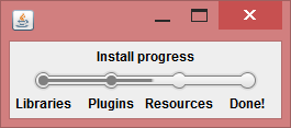
Here is a simple example:
It can be used in lots of different cases. For an instance - when you are guiding user through some steps it will perfectly fit in to display current progress, allow user to return to some previous steps or advance forward.
WebStepProgress is based on the list of StepData added into it through its constructor or various provided methods. This list can be modified at any time and component will properly reflect those changes.
StepData is a simple class containing step information. So far it contains only label component but with future updates it will get a few more options to set.
Progress display is based on two main things:
-
int selectedStep- determines which step from the list of added steps is currently selected -
float progress- determines the progress value on the way to the next step
By modifying those two values through various provided methods you are able to change current progress.
This is basically all about the data that WebStepProgress uses.
Usage of WebStepProgress is simple and straightforward - create it, add steps, use it!
Here is the simple example:
final WebStepProgress stepProgress = new WebStepProgress ( "One", "Two", "Three" );And this is how it look like:
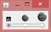
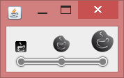
You can always provide your own components instead of plain text:
final WebStepProgress stepProgress = new WebStepProgress ( );
stepProgress.addSteps ( new WebImage ( WebLookAndFeel.getIcon ( 16 ) ) );
stepProgress.addSteps ( new WebImage ( WebLookAndFeel.getIcon ( 24 ) ) );
stepProgress.addSteps ( new WebImage ( WebLookAndFeel.getIcon ( 32 ) ) );
They will be properly displayed near the steps:
I have explained before how selectedStep and progress are related, let's look at some examples now:
final WebStepProgress stepProgress = new WebStepProgress ( );
stepProgress.setSelectionMode ( StepSelectionMode.progress );
stepProgress.addSteps ( new WebImage ( WebLookAndFeel.getIcon ( 16 ) ) );
stepProgress.addSteps ( new WebImage ( WebLookAndFeel.getIcon ( 24 ) ) );
stepProgress.addSteps ( new WebImage ( WebLookAndFeel.getIcon ( 32 ) ) );
stepProgress.setProgress ( 0.5f );
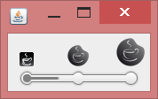
By default step under index 0 will be selected and since we set progress to 50% (0.5f) progress will display that we are half way to the second step:
There is also another method to set float progress but it affects the total progress, not only progress till the next available step:
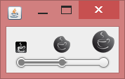
stepProgress.setTotalProgress ( 0.5f );It will affect both step and progress, but in this case 0.5f of total progress is equal to step 1 and progress 0.0f values, so you will see this:
You can also operate steps, but be aware that changing the step resets progress value to 0.0f to avoid unexpected results in some cases:
stepProgress.setSelectedStepIndex ( 2 );In this case last step will be selected:
As well as modifying progress and step you can always retrieve their current values from WebStepProgress instance for your own needs.
WebStepProgress also provides a simple way to allow user to modify (select) progress by pressing/dragging left mouse button anywhere inside the component. It is enabled by default and can be easily disabled:
stepProgress.setSelectionEnabled ( false );There are two available selection modes:
-
StepSelectionMode.step- allows only step selection - this one is similar to "snap to ticks" option ofJSlidercomponent and basically always attaches progress to one of available steps -
StepSelectionMode.progress- more advanced more that allows progress selection - I am not sure whether this is actually needed anywhere or not, but who knows
StepSelectionMode.step is used as the default mode, but you can change it whenever you want to.
If you found any mistakes or inconsistency in this article, feel that it is lacking explanation or simply want to request an additional wiki article covering some topic:
I will do my best to answer and provide assistance as soon as possible!
