This library is inspired by rajeshwar patlolla's Ionic1 Datepicker.
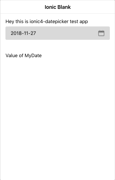
Here is how it looks
In your module file import it
import { Ionic4DatepickerModule } from '@logisticinfotech/ionic4-datepicker';
and in import array add it
IonicModule,
Ionic4DatepickerModule,
In your component declare your model variable and datepicker options.
myDate = 'YOUR_DATE'; (assign your selected date to this Object.)
let disabledDates: Date[] = [
      new Date(1545911005644),
      new Date(),
      new Date(2018, 12, 12), // Months are 0-based, this is August, 10th.
      new Date('Wednesday, December 26, 2018'), // Works with any valid Date formats like long format
      new Date('12-14-2018'), // Short format
];
datePickerObj:  any = {
      fromDate: new Date('2018-12-08'), // default 'null'
      toDate: new Date('2018-12-28'), // default 'null'
      showTodayButton: false, // default 'true'
      closeOnSelect: true, // default 'false'
      disableWeekDays: [4], // default '[]'
      mondayFirst: true, // default 'false'
      setLabel: 'S',  // default 'Set'
      todayLabel: 'T', // default 'Today'
      closeLabel: 'C', // default 'Close'
      disabledDates: disabledDates, // default '[]'
      titleLabel: 'Select a Date', // default 'null'
      monthsList: ["Jan", "Feb", "March", "April", "May", "June", "July", "Aug", "Sept", "Oct", "Nov", "Dec"],
      weeksList: ["S", "M", "T", "W", "T", "F", "S"],
      dateFormat: 'yyyy-MM-dd' // default 'dd MMM yyyy'
      clearButton : false , // default 'true'
    };
Available Options are: 1) fromDate(Optional) Date: if provided date object here, previous dates from this date will be disabled.
2) toDate(Optional) Date: if provided date object here, future dates from this date will be disabled.
3) showTodayButton(Optional) Boolean: boolean parameter relates to Today button hide/show, default value is true.
4) closeOnSelect(Optional) Boolean: very useful option to understand. Its default value is false. If it’s false Set button will be visible, and user has to click on Set to close model and get selected date value. If it’s True, Set button will be hidden and On Selection of Date, Model will be automatically close and Date value will be passed to our component.
5) disableWeekdays(Optional) array: Accepts number array 0(Sunday) to 6(Saturday). eg. [0, 3, 6] this will disable Sunday, Wednesday, Saturday in the whole calendar.
6) mondayFirst(Optional) Boolean : To show monday as first day Set to true. Default value is false, which means sunday is first day by default.
7) setLabel(Optional) Label : The label for Set button. Default value is "Set".
8) todayLabel(Optional) Label : The label for Today button. Default value is "Today".
9) closeLabel(Optional) Label : The label for Close button. Default value is "Close".
10) disabledDates(Optional) array : pass dates array if you like to make them disable from selection.
11) titleLabel(Optional) Label : By default no title will be show. If passed it will set model title.
12) monthsList(Optional) array : To change language or change month texts. You can create an array like below.
["January", "February", "March", "April", "May", "June", "July", "August", "September", "October", "November", "December"];
The default values are
["Jan", "Feb", "March", "April", "May", "June", "July", "Aug", "Sept", "Oct", "Nov", "Dec"];
13) weeksList(Optional) array : To change language or change week text. You can create an array like below.
["Sun", "Mon", "Tue", "Wed", "thu", "Fri", "Sat"];
The default values are
["S", "M", "T", "W", "T", "F", "S"];
14) dateFormat(Optional) String : This is date format used in template. Defaults to dd-MM-yyyy. For how to format date, and which format is accept see below site: https://angular.io/api/common/DatePipe
15) clearButton(Optional) Boolean : Boolean to specify whether to show the x button in ion-input or not, which will be used to clear value. default value is true.
Then in your html simply use it as below :
Use Ionic4-datepicker As a Directive (Preferred):
<ion-input [(ngModel)]="myDate" [liIonic4Datepicker]="datePickerObj" (ionchange)="myFunction()"></ion-input>
Use Ionic4-datepicker As a Component :
<li-ionic4-datepicker [(ngModel)]="myDate"
[inputDateConfig]="datePickerObj"></li-ionic4-datepicker>
For model to open as screenshot please add below css in your projects global.scss
.li-ionic4-datePicker {
  .modal-wrapper {
    height: 75%;
    width: 310px;
    border-radius: 0px;
    @media (min-width: 768px) {
       width: 350px;
       height: 65%;
    }
  }
}