Slack is a cloud-based set of team collaboration tools and services, or in simpler terms, an online chat application.
We use the Slack app almost every day to keep our communications with our classmates and the Ironhack team, but today we will be focusing on their landing page. In today's lab, we'll recreate Slack's landing page while ensuring it's responsive and adapts well to different screens. You can see the web page that we will be cloning here.
The goal of the lab is to create a responsive landing page using CSS and Flexbox.
-
Fork this repo
-
Clone this repo
-
Upon completion, run the following commands:
git add .
git commit -m "done"
git push origin master
-
Create a Pull Request so that your TAs can check your work.
The starter_code folder contains all the files you'll need. The images folder contains all the images you'll need for your page, although most of them are already displayed on the page.
The index.html already contains all the text and content needed. We will be focusing on the CSS and styling!
During each iteration, the first step you should do is to inspect the provided screenshots. These are included in each iteration, along with a preview of the final result. Use these as a starting point for implementing your styles.
Mobile first right? 😉
We will start by focusing on the styles for mobile screens first! 📱 Oh! Remember to use Flexbox to create the layout and display the content in rows or columns from the start. You'll be working on adapting the layout to different screen sizes in the following iterations, so it's essential that you start using Flexbox from start to end!
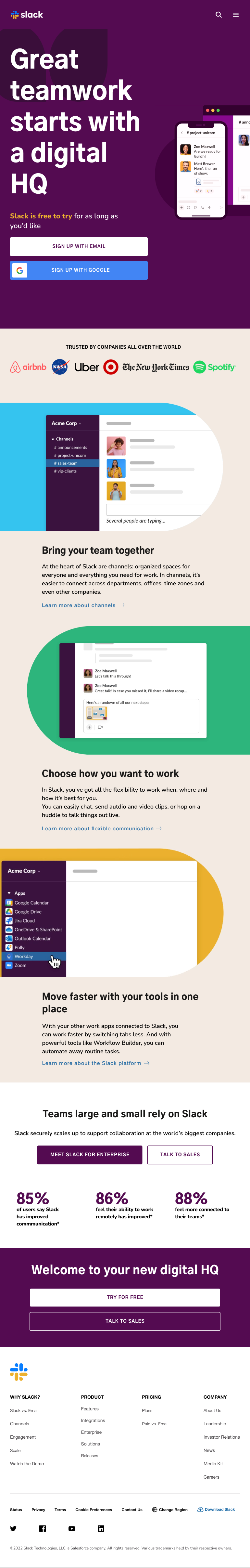
When done, your page should look like this: Preview - Mobile
Use the following page screenshot as the guide:

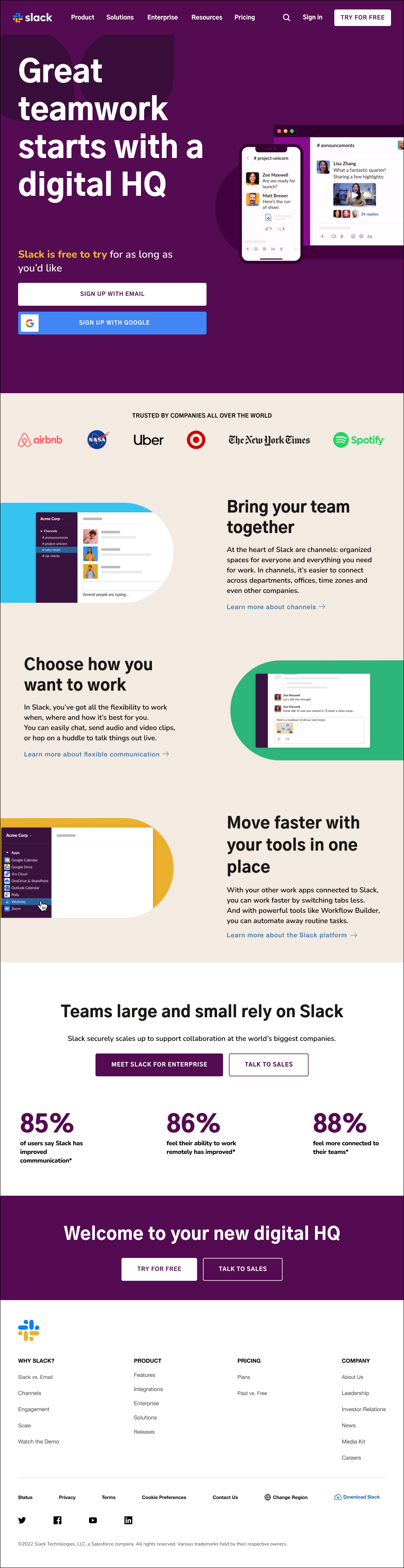
Let's start growing our screen size. In this iteration, you will work on making the website look great on small screens (iPads, tablets, or larger smartphones). You will have to use CSS media queries to apply the style and layout changes. Take a look at the preview and the screenshot to see the changes that are needed. Your task is to work on the following:
- The header should go from 1 column to display 2 columns: one with the content and buttons, and the other with the image.
- The company logos should be displayed in a single row.
- The images in the sections in the main part should be fully displayed and aligned to the left or right side of the page, respectively.
- The section "Teams large and small rely on Slack" should have the list items and the buttons displayed horizontally as rows.
- The sub-footer items, previously displayed as a column, should now be displayed in a single row.
When done, your page should look like this: Preview - Small Screens
Use the following page screenshot as the guide:
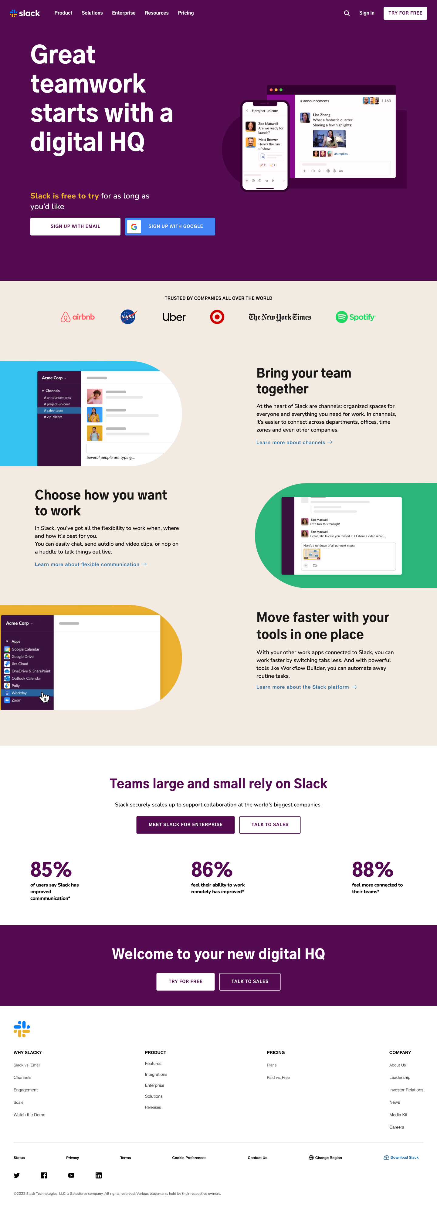
We'll continue by focusing on devices with medium-sized screens (notebooks and bigger tablets). Similar to the previous iteration, you will have to use CSS media queries to apply the style and layout changes. The most noticeable changes for this viewport size are:
- The navbar should now display all the menu links. The previously displayed menu icon should now be hidden.
- The sections in the main part should now display the content in 2 columns: one column for the heading and text, and the other for the image.
- The section "Welcome to your new digital HQ" should now have the buttons displayed horizontally as rows.
When done, your page should look like this: Preview - Medium Screens
Use the following page screenshot as the guide:
Last one! Some small changes and we are done! In this iteration we are targeting large-screen devices such as desktops and laptops:
-
The signup buttons in the header should now be displayed horizontally, next to each other.
-
Additionally, the image shown in the header should be centered and fully visible.
When done, your page should look like this: Preview - Large Screens
Use the following page screenshot as the guide:
Happy coding! ❤️
I am stuck in the exercise and don't know how to solve the problem or where to start.
If you are stuck in your code and don't know how to solve the problem or where to start, you should take a step back and try to form a clear question about the specific issue you are facing. This will help you narrow down the problem and come up with potential solutions.
For example, is it a concept that you don't understand, or are you receiving an error message that you don't know how to fix? It is usually helpful to try to state the problem as clearly as possible, including any error messages you are receiving. This can help you communicate the issue to others and potentially get help from classmates or online resources.
Once you have a clear understanding of the problem, you will be able to start working towards the solution.
How do I center align HTML text elements?
To center align HTML text elements, you can use the text-align property and set it to center. This property can be applied to any inline or block-level element.
Here is an example of how you can use the text-align property to center align multiple text elements:
HTML
<div>
  <h2>This is a title</h2>

  <p>This is some text in here</p>
</div>
CSS
/* CSS */

p {
  text-align: center; /* Center align all p elements */
}

h2 {
  text-align: center; /* Center align all h2 elements */
}
This will center align all p and h2 elements within the parent div.
For more information, check: W3C: Centering Things
How do I center align HTML block elements?
To center align a block-level element, such as a div, h1, etc., you can use the margin property and set it to auto. This will center the element horizontally within its parent container.
Here is an example of how you can do this:
HTML
<section>
  <div>
    <p> Lorem ipsum dolor sit amet consectetur, adipisicing elit.</p>
  </div>
</section>
CSS
/* CSS */

div {
  width: 500px;
  margin: 0 auto;
}
This will set the widh property of the div to 500 pixels and we set the left and right margin to be equal by using margin: 0 auto;.
How do I center align an HTML image element?
There are a few ways you can center aling an image element.
To center an image element in HTML, you can use the text-align property on the parent element, such as div. Example:
HTML
<div>
  <img src="https://placehold.co/300x150.png" />
</div>
CSS
div {
  text-align: center;
}
This will center align all the children elements within the section element, including the img element.
The other way is converting the image into a block element and using margin: 0 auto. Here is an example:
HTML
<section>
  <img src="https://placehold.co/300x150.png" />
</section>
CSS
img {
  display: block;
  margin: 0 auto;
}
This will center the image horizontally within the parent section element. The display: block property is used to make the image a block-level element, allowing the margin: 0 auto property to work. The margin: 0 auto property sets the left and right margins to be equal, centering the element within its parent container.
How can I change the header from having 1 column to having 2 columns?
To change the header of an HTML page from having one column to having two columns using Flexbox, you should do the following in your CSS:
- Use the
displayproperty and set it toflex. - Add the
flex-directionproperty and set it tocolumnto arrange the elements in a column. - Add the
justify-contentproperty to align the elements horizontally - Use the
align-itemsproperty to align them vertically.
header {
  display: flex;
  flex-direction: column; /* Arrange elements in a column */
  justify-content: space-between; /* Align horizontally */
  align-items: center; /* Align vertically */
}
To make the header responsive and change it to a two column layout on screens that are wider than 800 pixels, use a media query and set the flex-direction property to row:
@media (min-width: 800px) {
  header {
    flex-direction: row;
  }

  /* Change the width of nested div elements */
  header > div {
    width: 50%;
  }
}
On smaller screens, the header will maintain a single column layout, but on screens larger than 800 pixels wide, it will change to a two column layout.
Why are my media query styles not displaying properly on my browser?
When using media queries to create a responsive layout, it is recommended to start with the default styles for mobile (smaller) screens, and then use media queries at the end of your stylesheet to apply styles for each increasing viewport size.
There are a few possible reasons why your media query styles may not be displaying properly on your browser
- Check that you already have default styles for mobile screens, where applicable. These styles should be placed at the beginning of your stylesheet, before your media queries.
- Make sure that you have placed your media queries at the end of your stylesheet, after your regular styles. This is because media queries are applied after regular styles, so if you place them before your regular styles, they will be overridden.
- Make sure that you have the correct syntax in your media query. The correct syntax is
@media (expression) {...}. - Make sure that you are using the correct media query expression. For example, if you are trying to target screens that are wider than 800 pixels, you should use the
min-widthin your expression, like this:@media (min-width: 800px) {...}.
For more information on CSS media queries, check: MDN: Beginner's guide to media queries