

If you like the project, please give the project a GitHub 🌟

Documentation for V4 - Github Page.
Documentation for V5 - ReactTooltip.
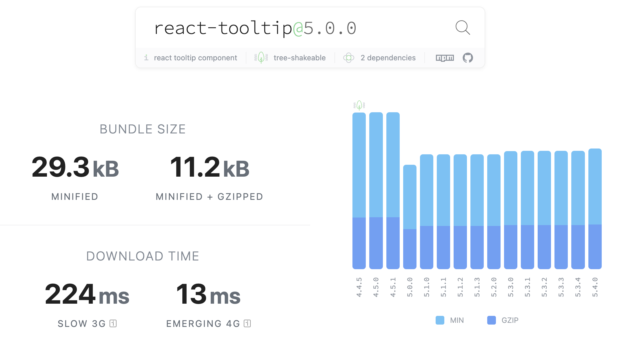
Bundle size timeline comparation from V4 -> V5
npm install react-tooltipor
yarn add react-tooltip
⚠️ If you were already usingreact-tooltip<=5.7.5, you'll be getting some deprecation warnings regarding theanchorIdprop and some other features. In versions >=5.8.0, we've introduced thedata-tooltip-idattribute, and theanchorSelectprop, which are our recommended methods of using the tooltip moving forward. Check the docs for more details.
1 . Import the CSS file to set default styling.
import 'react-tooltip/dist/react-tooltip.css'This needs to be done only once. We suggest you do it on your src/index.js or equivalent file.
2 . Import react-tooltip after installation.
import { Tooltip } from 'react-tooltip'or if you want to still use the name ReactTooltip as V4:
import { Tooltip as ReactTooltip } from 'react-tooltip'3 . Add data-tooltip-id="<tooltip id>" and data-tooltip-content="<your placeholder>" to your element.
data-tooltip-idis the equivalent of V4'sdata-for.
<a data-tooltip-id="my-tooltip" data-tooltip-content="Hello world!">
  ◕‿‿◕
</a>
4 . Include the <Tooltip /> element.
Don't forget to set the id, it won't work without it!
<Tooltip id="my-tooltip" />You can also set the anchorSelect tooltip prop to use the tooltip with multiple anchor elements without having to set data-tooltip-id on each of them.
anchorSelect must be a valid CSS selector.
<a className="my-anchor-element" data-tooltip-content="Hello world!">
  ◕‿‿◕
</a>
<a className="my-anchor-element" data-tooltip-content="Hello to you too!">
  ◕‿‿◕
</a>
<Tooltip anchorSelect=".my-anchor-element" />
Check the V5 docs for more complex use cases.
You can import node_modules/react-tooltip/dist/react-tooltip.[mode].js into your page. Please make sure that you have already imported react and react-dom into your page.
mode: esm cjs umd
Don't forget to import the CSS file from node_modules/react-tooltip/dist/react-tooltip.css to set default styling. This needs to be done only once in your application.
PS: all the files have a minified version and a non-minified version.

For all available options, please check React Tooltip Options
The html option allows a tooltip to directly display raw HTML. This is a security risk if any of that content is supplied by the user. Any user-supplied content must be sanitized, using a package like sanitize-html. We chose not to include sanitization after discovering it increased our package size too much - we don't want to penalize people who don't use the html option.
You can use renderToStaticMarkup() function to use JSX instead of HTML.
Example:
import ReactDOMServer from 'react-dom/server';
[...]
<a
  data-tooltip-id="my-tooltip"
  data-tooltip-html={ReactDOMServer.renderToStaticMarkup(<div>I am <b>JSX</b> content</div>)}
>
  ◕‿‿◕
</a>How I insert sass into react component
danielbarion Maintainer - Creator of React Tooltip >= V5.
gabrieljablonski Maintainer.
aronhelser (inactive).
alexgurr (inactive).
pdeszynski (inactive).
roggervalf (inactive).
huumanoid (inactive)
wwayne (inactive) - Creator of the original React Tooltip (V1.x ~ V4.x.)
We would gladly accept a new maintainer to help out!
We welcome your contribution! Fork the repo, make some changes, submit a pull-request! Our contributing doc has some details.
MIT