Chip Component
- Overview
- User Stories
-
Functionality
- 3.1. User Interface
- 3.2. Features
- 3.3. API
- ARIA support
- Assumptions and Limitations
- References
Provide compact elements that represent an input, attribute, or action.
Elaborate more on the multi-facetted use cases
As a developer, I want to:
- have a single chip component that can be easily templated(1)
- have a chip group/area that can manage as many chips as I need.
- have a templatable prefix(2) that can contain avatar/logo/icon or anything similar, so that I can give further visual clues about the chip.
- have a templatable label(3) in the chip, so that the chip can exit as a separate entity.
- have a templatable suffix that can contain avatar/logo/icon or anything similar
- be able to add a “Remove” icon, so that the user will be able to remove the chip.
- to be able to change background of the chip, so that it would be consistent with the rest of the application.
- be able to move chips around using drag & drop without too much custom implementation
- have the chip component throw events when being removed, moved or dragged.
- have the chip area throw events when chips have been reordered.
- set min and max size of the chip W/H?
- choose how the chips should be rendered inside the chip area - horizontally or vertically? Maybe using different types of chip areas?
As an end user, I want to:
- Story 1: Have a visual area (chip area) containing different easily distinquished elements (chips) that contain some sort of information.
- Story 2: Be able to easily move around chips around on desktop by dragging using mouse.
- Story 3: The chips to be touch friendly and be able to easily move them using touch interactions.
- Story 4: Have a clear indication when a chip can be removed and how that can be done.
- Story 5: Be able to select one or multiple chips.
- Story 6: Be able to select a chip and using keyboard navigation to navigate towards next or previous chips.
- Story 7: Be able to select a chip and using certain key combinations move it left/right.
Must-have before we can consider the feature a sprint candidate
...
Describe behavior, design, look and feel of the implemented feature. Always include visual mock-up
The IgxChipComponent is the main class for a chip elemenent and the IgxChipsAreaComponent is the main class for the chip area that handles more complex management of multiple chips like moving, selection, multiple selection and keyboard navigation.
The IgxChipComponent requires an id to be defined so that the different chips can be easily distinguished by the user when for example chips should change their position, are being removed or selected. This is because the chip elements and chip area actually do not modify the DOM structure. This is left to the user to do it how he fits best for his application by using the provided inputs, events and methods.
Example of using igxChip with igxChipArea:
<igx-chips-area>
<igx-chip *ngFor="let chip of chipList" [id]="chip.id">
<label igxLabel>{{chip.text}}</label>
</igx-chip>
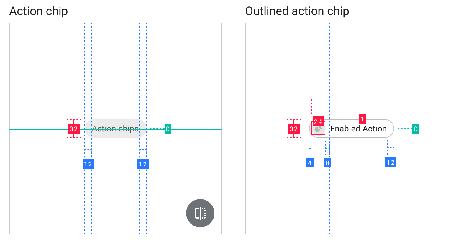
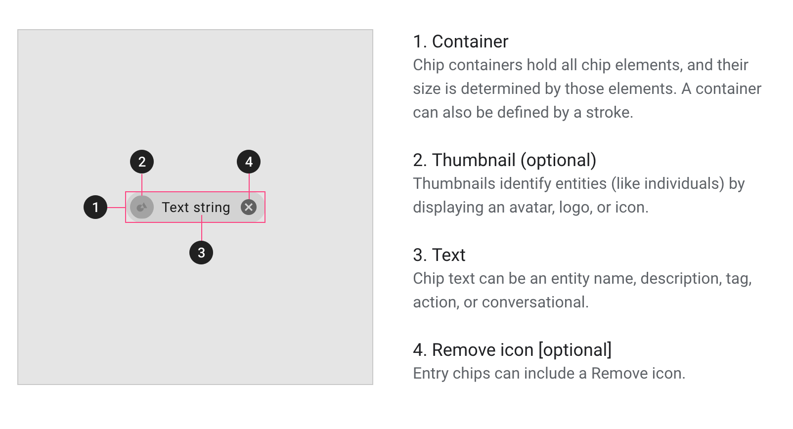
</igx-chips-area>The IgxChipComponent's main structure consists of label, remove button, prefix, suffix, prefix connector and suffix connector. All of those elements are templatable except the the remove button.
The prefix, label and suffix are elements inside the actual chip area where they can be templated in any way the user would desire. Each has function defined by its name. The prefix is area infront of the label, the label is area between the prefix and suffix and the suffix is at the back after the label. The way they can be specified is by respectively using the IgxPrefix, IgxLabel and IxgSuffix directives.
Example of using and icon for prefix, text for label and custom icon button for suffix:
<igx-chip *ngFor="let chip of chipList" [id]="chip.id">
<igx-icon igxPrefix fontSet="material" [name]="'drag_indicator'"></igx-icon>
<label igxLabel>{{chip.text}}</label>
<span igxSuffix *ngIf="removable" igxButton="icon" (click)="onClick()">
<igx-icon fontSet="material" [name]="'close'"></igx-icon>
</span>
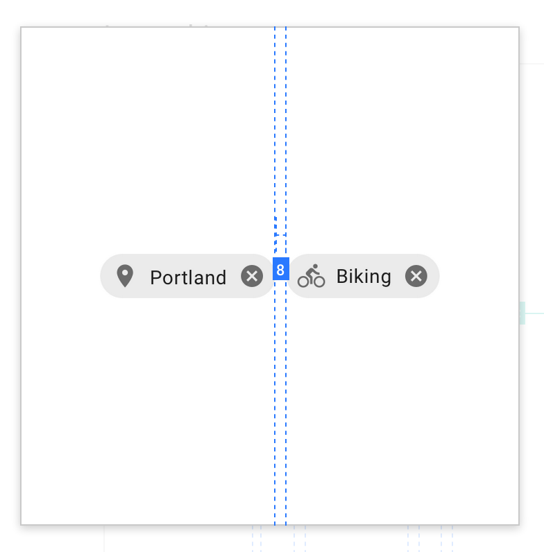
</igx-chip>The prefix/suffix connectors of the igxChip are fully templatable and are poistioned outside the chip area. Their purpose is to provite a way to link two chips next to each other with an icon/text or anything the user woud like to use. The first chip does not have prefix connector applied and the last chip does not have suffix connector applied. They hide while dragging chips around and show again when interactions with the chips have finished. The prefix connector is defined by using the IgxPrefixConnector directive. The suffix connector is defined by using the IgxSuffixConnector directive.
Example of using prefix connector:
<igx-chip *ngFor="let chip of chipList" [id]="chip.id">
    <span igxPrefixConnector> > </span>
    <label igxLabel>{{chip.text}}</label>
</igx-chip>
Example of using suffix connector:
<igx-chip *ngFor="let chip of chipList" [id]="chip.id">
    <label igxLabel>{{chip.text}}</label>
    <span igxSuffixConnector> -> </span>
</igx-chip>The remove button is part of the chip area as well, but it is not templatable but can be customized. It can be enabled through an option of the igxChip itself called removable. When enabled the remove button will be position between the label and the suffix areas.
When clicking on the button the igxChip provides an event that the user can use to use to know when the chip should be removed. The chip itself is not removed from the DOM by default when clickin on the button unless the user removes it.
Selection is disabled by default, but can be enabled with an option called selectable. The selecting is done by clicking on the chip itself whitout performing moving/dragging. An event is fired when the selection state of the igxChip changes.
Users can move through the chips using the arrow keys and select/deselect them with the space. Chips also gain focus when clicked, ensuring keyboard navigation starts at the appropriate chip.
| Name | Description | Type | Default value |
|---|---|---|---|
| id | ID by which each chip is distinguished | any | undefined |
| removable | Defines if the chip should render remove button and throw remove events | boolean | false |
| selectable | Defines if the chip can be selected on click or throught navigation | boolean | false |
| selected | Sets/Gets selected state of the chip if selectable | boolean | false |
| minWidth | Defines minimum width for the chip | number | undefined |
| minHeight | Defines minimum height for the chip | number | undefined |
| maxWidth | Defines maximum width for the chip | number | undefined |
| maxHeight | Defines maximum height for the chip | number | undefined |
| Name | Description | Return type | Parameters |
|---|---|---|---|
| select() | Marks the chip as selected when this method is called | boolean | - |
| deselect() | Marks the chip as selected when this method is called | boolean | - |
| Name | Description | Cancelable | Parameters |
|---|---|---|---|
| onClick | Event fired when the user has clicked without moving the chip | false | owner |
| onMoveStart | Event fired when the user starts moving the chip by dragging | false | owner |
| onMoveEnd | Event fired when the user stops moving the chip and the chip has returned to it's initial position | false | owner |
| onRemove | Event fired after the chip is specified that can be removed and the remove buttin is clicked | false | owner |
| onSelect | Event fired after the chip has been selected | false | owner |
| Name | Description | Type | Default value |
|---|---|---|---|
| width | Width of the chips area | number | undefined |
| height | Height of the chips area | number | undefined |
| Name | Description | Return type | Parameters |
|---|---|---|---|
| Name | Description | Cancelable | Parameters |
|---|---|---|---|
| onOrderChange | Event thrown when a chip has been moved and the order of the chips should change. Provides array of chip components that has the new order | true | chipsArray, isValid |
| onSelectionChange | Event fired when the user has selected new chip/chips. Provided array of selected chip components | false | chipsArray |
A chip-list behaves as a role="listbox", with each chip being a role="option". The chip input should have a placeholder or be given a meaningful label via aria-label or aria-labelledby.
| Assumptions | Limitation Notes |
|---|---|
https://material.angular.io/components/chips/examples https://material-components.github.io/material-components-web-catalog/#/component/chips https://material.io/design/components/chips.html#input-chips https://docs.flutter.io/flutter/material/Chip-class.html